Epidemic Outbreak
Table of Contents
Intro
Recently there has been an epidemic outbreak in Asia. As a data scientist, I keep wondering why it is so difficult to develop a new vaccine and contain the virus. Challenges on Kaggle such as identifying rare animal species are beneficial for both participants and scientific research organizations behind them. Those big pharmaceutical companies may be able to break down big problems into small chunks and outsource to the data science crowd for free. We, data scientists not Messiah, cannot rescue Koala from Australian bushfire or identify the potential Ebola infected in West Africa. And the data, the asset we value the most, leaves a heavy carbon footprint on the planet (because of the server). Yet, crunching number to help the humanity is the least if not the only we can offer. Most of us just pour all our resources to beat S&P500 by several decimals or improve facial recognition on the minority. Where is the overhyped AI now?
While I was searching for k core graph in my university material, I discovered a module I have never taken called epidemic spreading on complex network. It suddenly struck me that we could apply graph theory to construct an agent-based model. The model would be able to simulate the epidemic outbreak and forecast the prevalence and the duration. That was the least I could contribute to this shitstorm caused by mankind. This project started there.
The simulation of epidemic network is created via Gillespie Algorithm.
Non-linear Regression
Before moving onto a random graph, I took a naïve approach to predict the final death toll of novel corona virus by Gompertz curve. The idea was inspired by an article on U.S. Centre of Disease Control journal (Emerging Infectious Diseases Vol. 10, No. 6, June 2004, Page 1165). The researchers intended to study the effectiveness of intervention measures during SARS pandemic in 2003. They chose Richard’s curve (which is a generalized logistic model) of different training data horizon to predict the potential result. Thus, the first step of this project was to replicate the similar result for SARS in 2003.
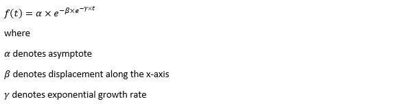
Instead of Richard’s curve, the model took Gompertz curve, a special form of generalized logistic model. Gompertz was used to study the population in a confined space and the growth of tumor, which also makes it applicable to examine the spread of a disease.
Inevitably, there are other special forms of Richard's curve which are still fit for the purpose. Weibull, Janoschek, Morgan-Mercer-Flodin, von Bertalanffy, Levakovic, Hossfeld, Korf, etc.
The training data came from WHO official website. The full script of web scraping and ETL is attached. I have to make a complaint on how inconsistent the format of WHO report is. I probably spent 10 minutes to set up the web scraper and another 30 minutes to design the model and the visualization. The data cleansing alone took me several hours. You are free to use the clean spreadsheet as long as you mention it comes from my hours of sweating and swearing.
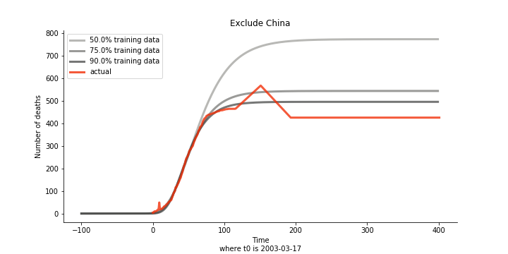
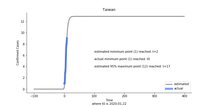
Initially we look at the cumulated number of cases reported by WHO. The biggest challenge of the model is the data quality (not that different from the other data science problems). Due to various reasons (cover up, fake number), we exclude China to represent the global impact. We have observed some small bumps from the actual curve (Taiwan and U.S. discarded some of the cases). They are most likely caused by false positive and false negative. Unfortunately, WHO didn’t revise their old reports after the publish. The retract of cumulated number is really unacceptable.
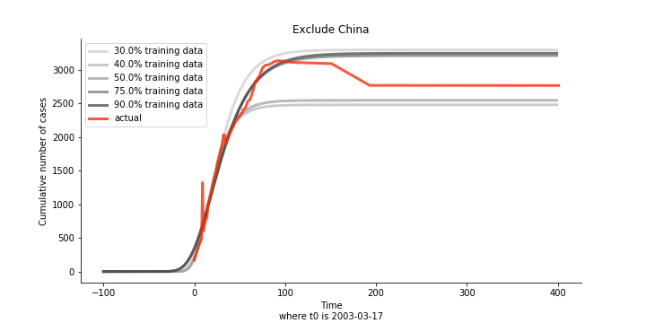
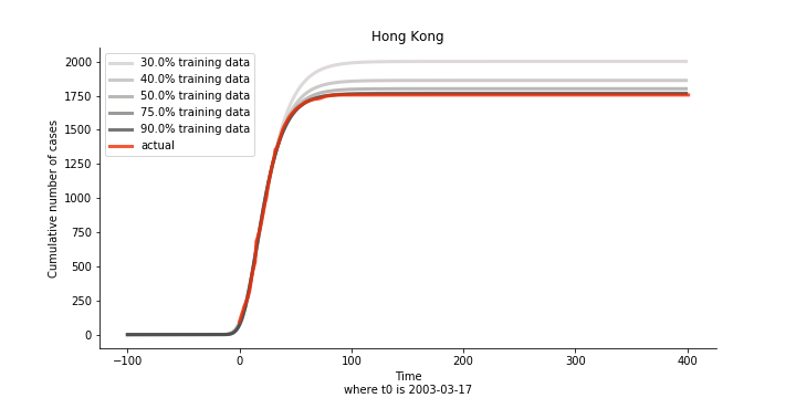
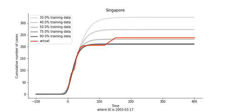
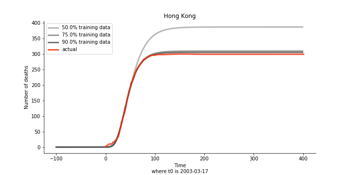
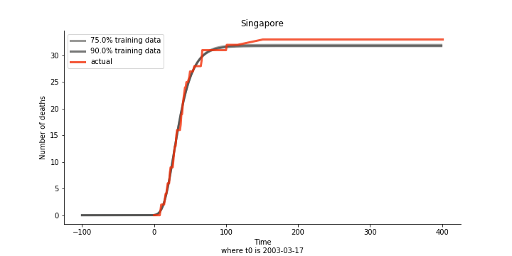
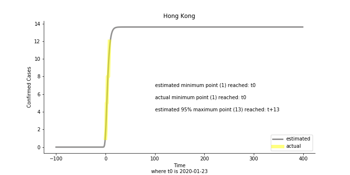
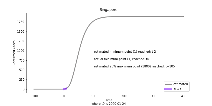
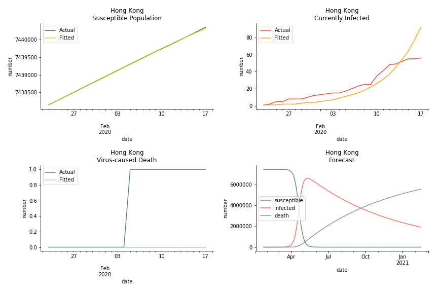
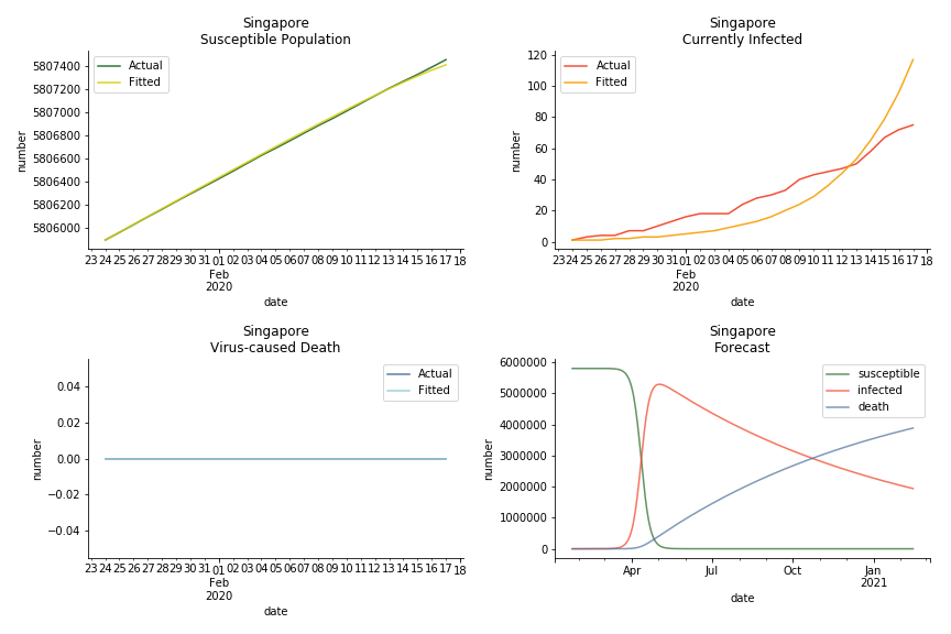
The figures of Hong Kong and Singapore demonstrate a perfect logistic curve. We have to praise the high-quality data provided by these two city states (crown jewels of Asia). The figures also show the early stage of forecast is perhaps overestimated. The result generated by first 30% or 40% training data is way too high. Two reasons could contribute to this phenomenon. One is the exponential growth rate of early stage. It may sound a bit counter intuitive. Gompertz curve is supposed to be a slow start, bonanza in the middle and slow ending. However, governments don’t normally report zero cases to WHO or WHO doesn’t include zero cases. If you look at the first report of WHO, it was issued on March 17th where both Hong Kong and Singapore have more than one case. We may never be able to detect the real early stage. The second reason could be the governments vowed to contain the virus with whatever it took after the initial outbreak. The effect of border seal, immigration check and patient quarantine kicked in. It slowed down the exponential growth rate. The saturation point of the curve shifted downwards accordingly. I sincerely hope it’s the latter reason or a mix of both. We still haven’t found out what really drove SARS away. The hypothesis of heat doesn’t hold as the winter of Singapore is still above 28 Celsius degrees.
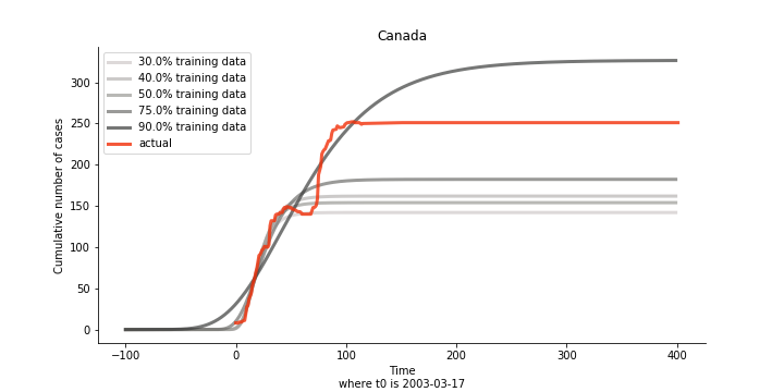
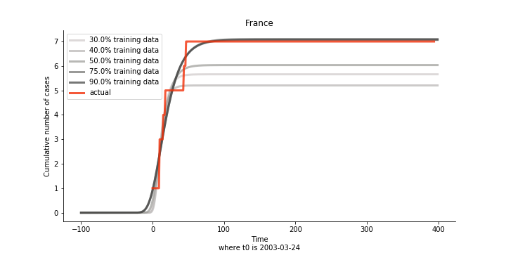
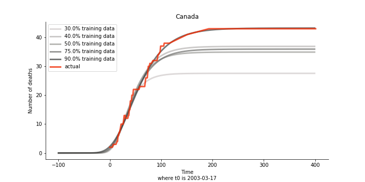
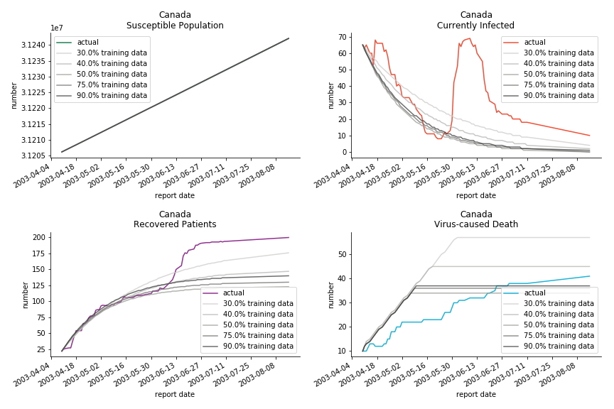
There are strange cases where the early stage estimation turns out to be optimistic. For Canada, the government changed the definition of infection on May 30th, 2003 which led to a second hike. Pour la France, je ne sais pas ce qui s’est passé, ça a été très rapide. 😂
Let’s turn to the final death toll. The similar pattern from the previous cases exists as well.
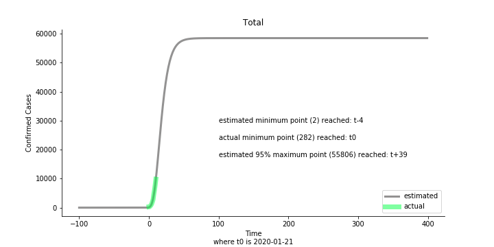
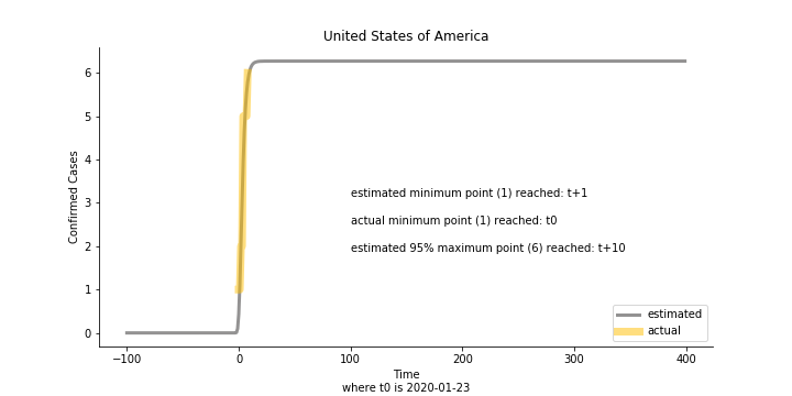
Now that we have showed the model is valid, the same methodology will be used to produce an early forecast for the novel corona virus. The data is still collected from WHO situation reports. The format is even worse this time as the data is inside pdf files. Do you know that WHO staff type in every number manually? They seriously need a technology upgrade. You are still free to use the aggregated data as long as you give me enough credits. Aside from the terrible format, you would notice the change of format and metrics is no coincidence. If you relate it to the visit of WHO chief, I am pretty sure you would get the delicate political message.
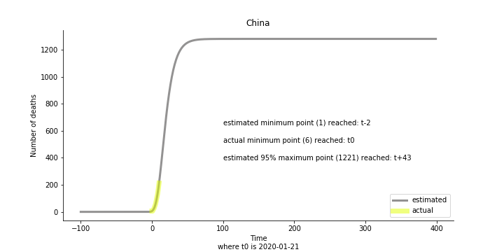
Looking at the model, the global infection number may reach to 58K!! That’s why they say the novel corona virus is more contagious than SARS. Given 39 days, it is going to reach 95% maximum infection number which is about 56K. Please take notice of that the 95% maximum doesn’t imply 95% quantile. I just assume 95% maximum is where the curve exits its exponential growth rate.
Based upon the model, the impact on U.S. or Hong Kong or Taiwan seems quite limited (very skeptical on that). The impact on Singapore is going to be severe. But I am pretty sure Singapore will manage to change the course.
Currently death only occurs in China. The ultimate death toll in China might be 1280, which is higher than SARS. In proportion to the infection number, estimated case fatality rate is 2% respectively, much lower than SARS. In about 43 days, the whole situation is supposed to quiet down. Thoughts and prayers.
In general, this is an early stage pessimistic estimation. Please take it with a grain of salt. So far, I have only managed to obtain 11 available data points from WHO. The model on some of the countries (e.g. Australia, France, Japan) do not even converge. In reality, 90% of the models fail miserably. There is no need to panic from the model projection or take comfort in the low mortality. One thing we should learn from the model. Carpe diem.
This chapter is finished on February 1st, 2020. No further updates.
Dynamic System
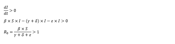
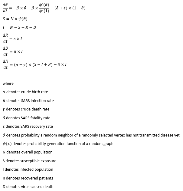
Gompertz curve is a naïve but effective approach. It is comprehensive and it can work with simple data structure. But the shortcoming of Gompertz curve is that we need to forecast cumulated infected cases and virus-caused death independently. In reality, they should be intertwined to a certain degree. That is when the classic approach of epidemic modelling, SIR model, kicks in. This compartmental model is the foundation of the modern epidemiology. It is a dynamic system consisted of three ordinary differential equations which represents Susceptible, Infected and Recovered population. It has the capability of mapping out the prevalence and the duration of an epidemic outbreak. The flipside of the coin is too many pre-assumptions and conditions attached.
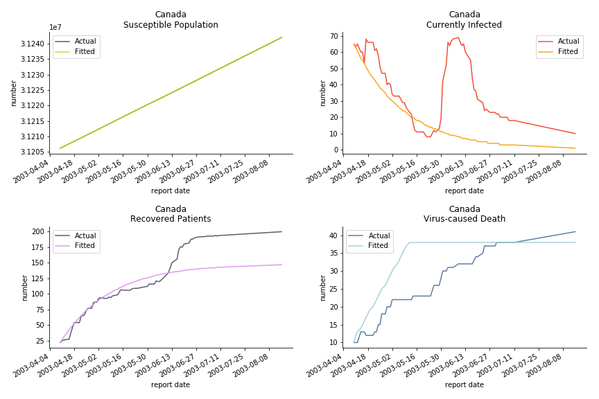
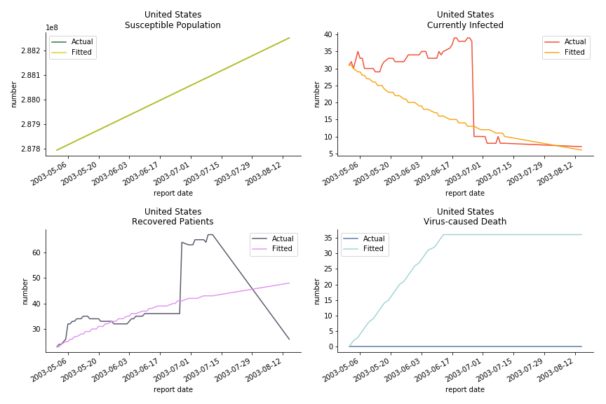
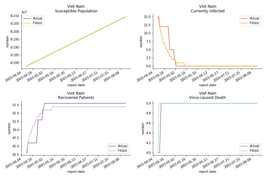
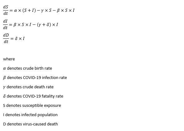
The model for SARS is quite straight forward. It takes the classic form of SIR model with vital dynamics. As the data is on a daily basis, all rates inside the model are daily rates. In some literatures, S, I and R takes the form of intensive rather than extensive variables. Here, S, I and R are the actual numbers instead of proportions inside a population.
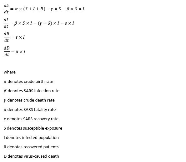
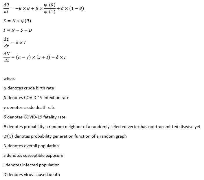
The susceptible exposure S of any given time t is determined by three factors. The first is the crude birth rate α of all the living population (including the infected ones). It is based upon a case recorded on U.S. Centre of Disease Control journal (Emerging Infectious Diseases Vol. 10, No. 2, February 2004, Page 345), which the pregnant mother infected with SARS delivered a healthy infant. Whether it was due to the dedication of the health care workers or the contagion limit of the virus, we assume the virus cannot pass from the infected parents to the next generation. As long as you are not six feet deep under, you can deliver a healthy child, sadly another susceptible target. So far, there is no evidence suggesting the immunity can pass onto the second generation. Therefore, the inclusion of recovered patients is necessary. The second factor is the crude death rate γ on the susceptible exposure S. The cycle of life and death is inevitable even if you don’t get infected with virus. The third factor is the infection rate β. It quantifies the possibility of converting a susceptible individual to an infected patient. The conversion should be proportional to the respective numbers of S and I in the population. In general, susceptible curve follows an exponential equation, like Gompertz curve.
The infected population I of any given time t is what we care the most. Aside from the conversion from S, there are two other factors. One factor is the recovery rate ε. Patients with good immune system and scientific treatment shall recover at the given rate ε. The other is the grim reaper. The deadly virus could take lives by fatality rate δ, of course. The disputed part is crude death rate γ. Without the virus, those who could have become the infected population can still die from a natural cause. Everybody in our system regardless of gender and ethnicity is equal to Anubis. Assuming a 90-year-old grandma with diabetes complications, she is about to die in the next 7 days. Two days later, his grandson who carries SARS but shows no symptoms passes the virus to her. After another five days, grandma passes away with respiratory infections. What is the cause of death diagnosis then? As you can see, it is difficult for the hospital to note the distinction between virus-caused death and non-virus-related-death. There is nothing wrong to provide a counter argument to challenge this assumption. If you intend to remove crude death rate γ from the infected population I, you must change the calculation of R null as well.
The recovered patients R of any given time t involves the conversion from I. In SIR model, the underlying R will obtain lifetime immunity from the virus after recovery. You may wonder why crude death rate γ does not play a role in the recovered patients. In theory, it should. In fact, recovered patients are not closely monitored after they pose no virus threat to the general public. Sadly, their death does not exist in WHO reported numbers.
The recovered patients R of any given time t involves the conversion from I. In SIR model, the recovered patients R will obtain lifetime immunity from the virus after recovery.
The last one, virus-caused death D, is not explicitly stated in the dynamic system. It is impacted by the number of the infected population I and the virus fatality rate δ.
The model we use for SARS is a deterministic model without stochastic features. SIR model has many variations such as SIS (where recovered patients can still get infected due to virus mutation), SEIR (the virus targets at people with certain genes or features, people don’t immediately get infected after exposure for various reasons), etc. You will find more models at Institute for Disease Modelling. There are plenty of literatures on SARS epidemic modelling with more advanced models. They introduce other variables like quarantined patients and super spreaders. You will find them in the further reading section. Truth be told, the choice of SIR comes from the constraint of the data. Data is the new oil, no? There is only so much offered by WHO.
Now that we have set up the differential equations in the dynamic system, we should get hands on the modelling. Crude birth rate α and crude death rate γ are acquired from United Nations Statistics Division. This is one of the best databases and datamarts I have ever seen across all the free data sources. In contrast to WHO, UN deserves some kudos for the clean-cut CSV format. Though we need to convert α and γ from annual rate to daily rate before leveraging them. Thus, the unknown parameters are infection rate β, fatality rate δ and recovery rate ε. They will be estimated by non-linear least square method. The objective is to minimize the cost function, sum of squared standardized error, by Nelder-Mead algorithm.
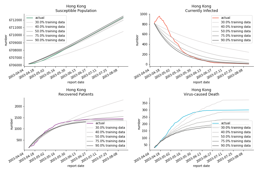
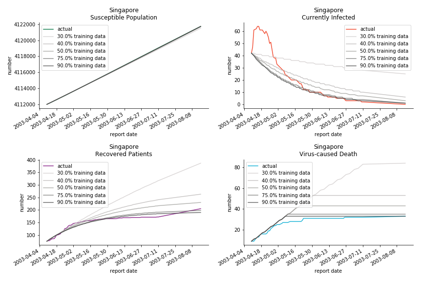
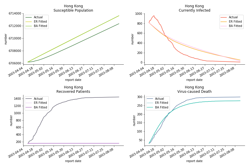
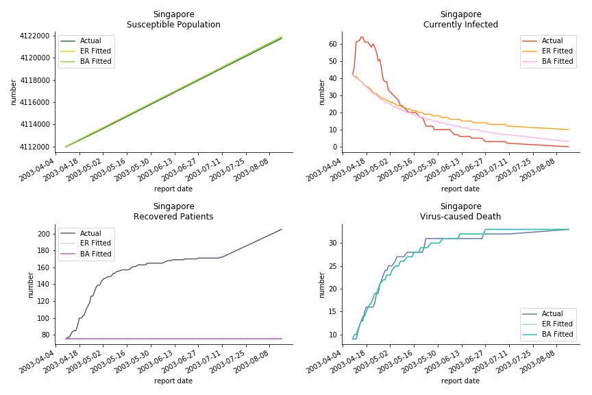
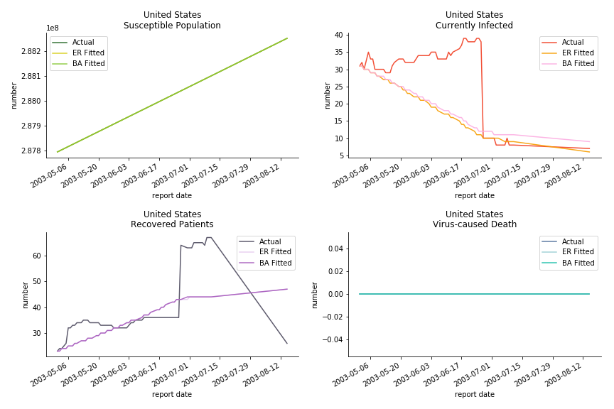
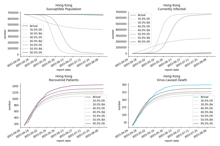
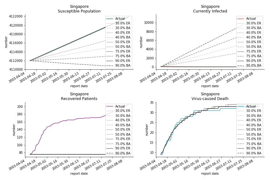
The perfect match of in-sample data for Hong Kong and Singapore is splendid. Both recovered patients R and virus-caused death D surge. However, the dynamic system seems to miss the late spike of currently infected population I before its downfall. Unfortunately, WHO didn’t keep track of recovery data until April 4th, 2003. Typically, we can never get the data dated back to the real T0. This is the result of modelling on data from T+N. The fatality rate δ of both is approximately 2%. The underlying δ implies about 2% of the infected population I dies from the virus every day.
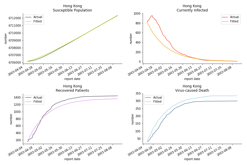
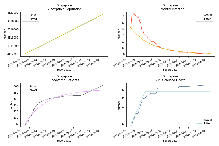
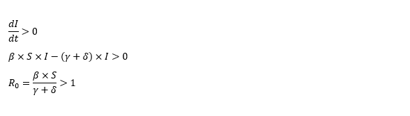
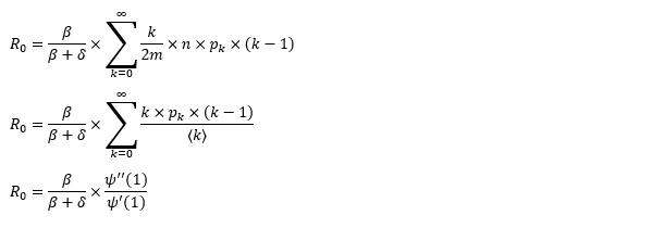
The basic reproduction ratio R0 for Hong Kong and Singapore are 0.5 and 0.7. R0 refers to the expected infected individuals of the next moment when only one infected person occurs in the entire population. R null larger than 1 is the pre-condition of an epidemic outbreak. As our simulation begins in the middle of the process, no wonder we observe a relatively small R null. The table in Wikipedia suggests R0 for SARS should oscillate between 2 and 5.
The basic reproduction ratio of our model can be derived from the following steps.
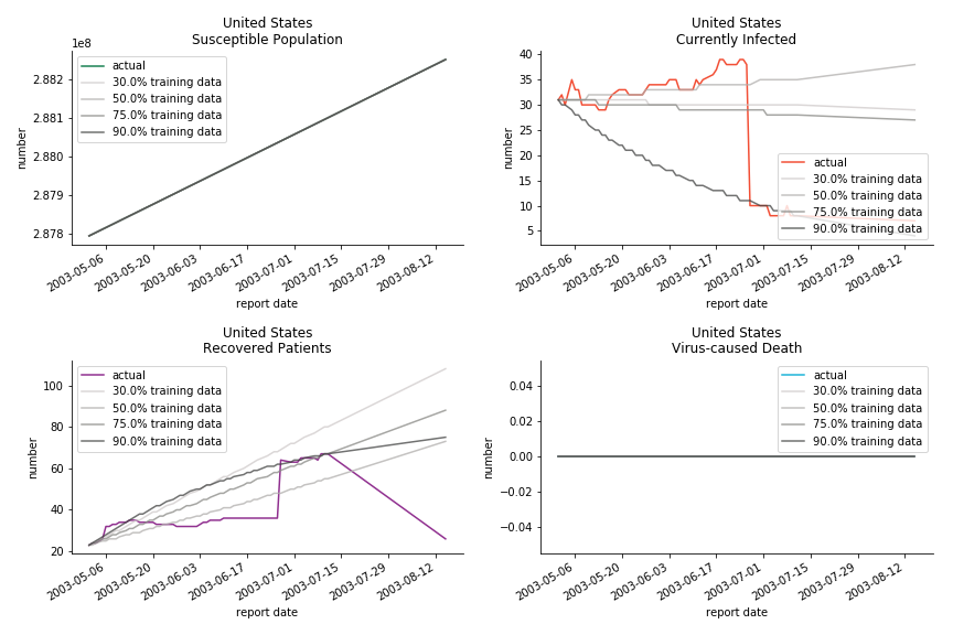
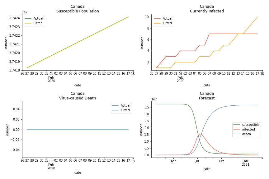
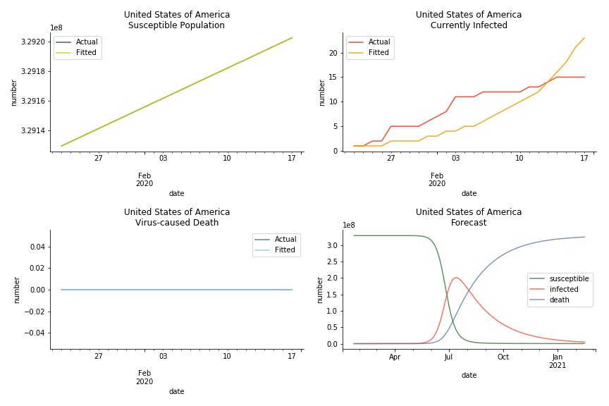
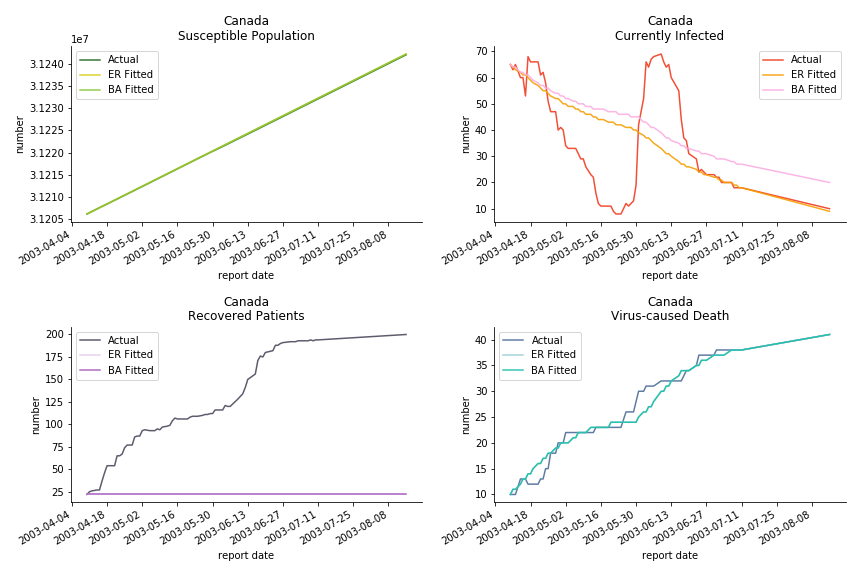
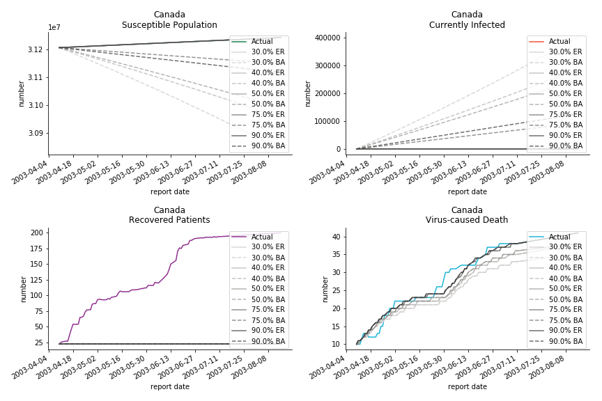
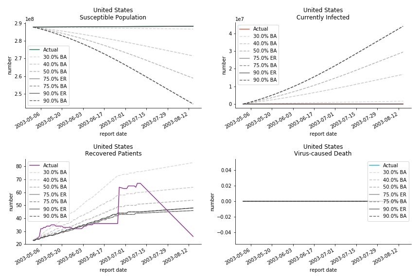
The case of North America is slightly off the track. As mentioned earlier, any change of definition or retraction will lead to a spike or a dip, which has an overwhelming impact on the model. The daily fatality rate δ for U.S. is 3%, a bit higher than 2% for Canada. The basic reproduction ratio R0 for both are roughly the same, 0.7 and 0.6.
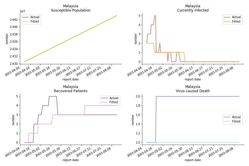
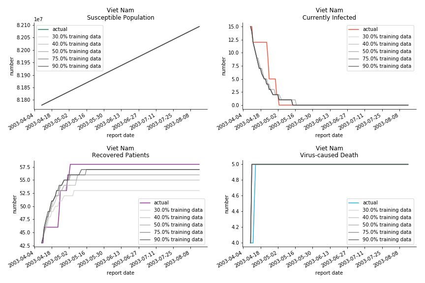
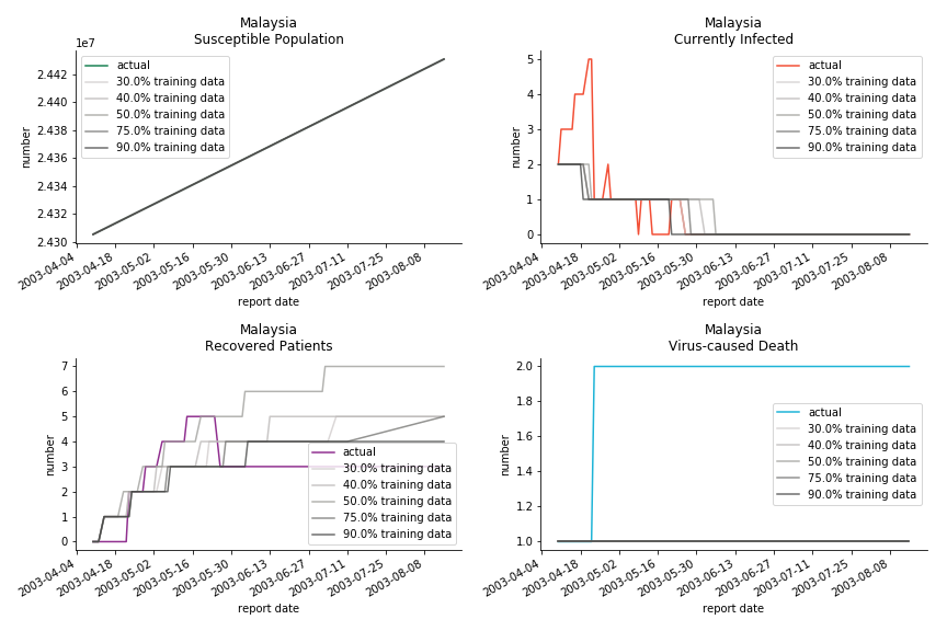
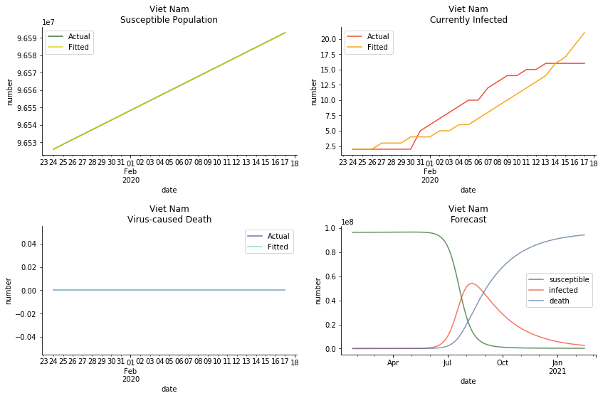
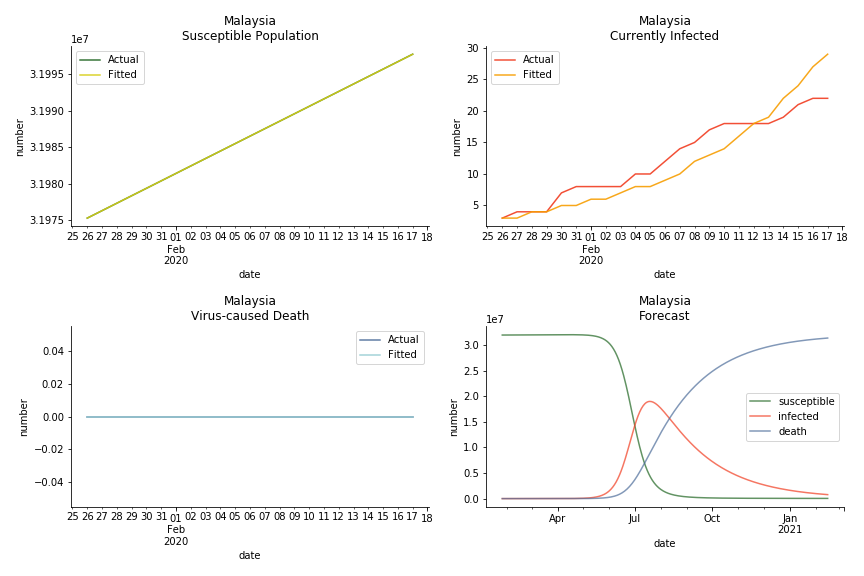
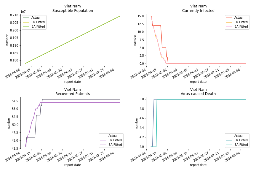
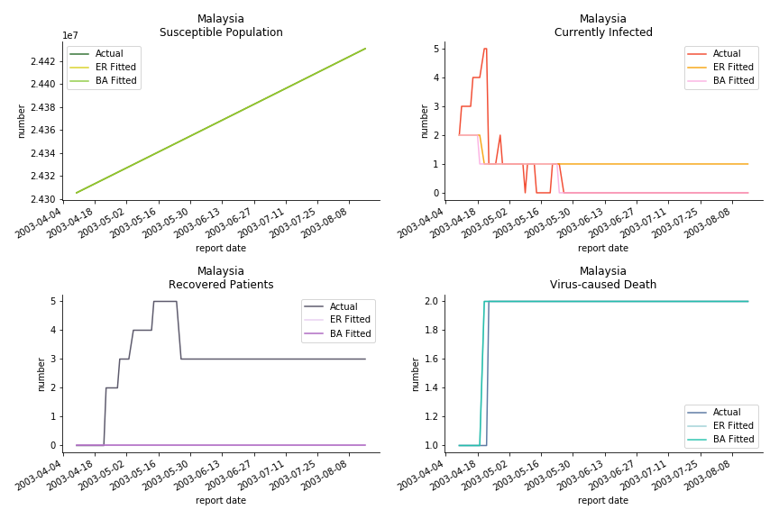
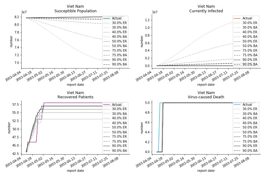
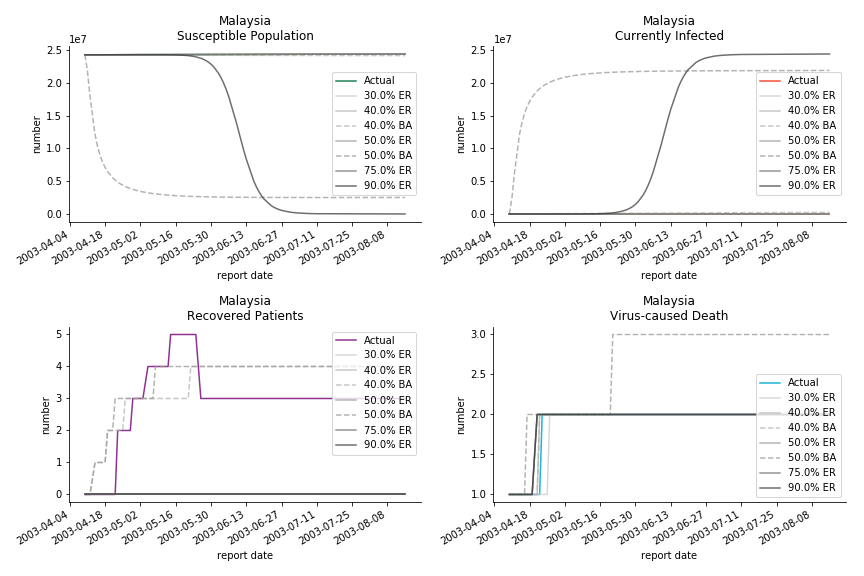
The in-sample data for ASEAN countries are also fantastic. The dynamic system precisely captures S, I and R. Even though D is not in the differential equations, it is still within marginal errors. The daily fatality rates δ for Viet Nam and Malaysia are 4% and 3%. You can argue it is caused by the poor local health infrastructure. R0 is an odd case here. For Viet Nam, it is only 0.2, but it is 0.7 for Malaysia.
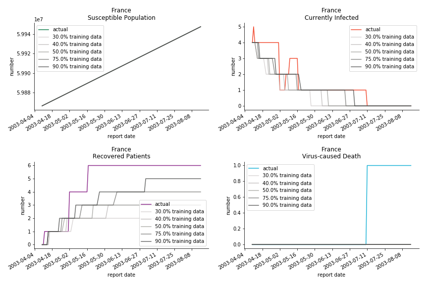
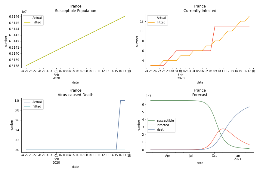
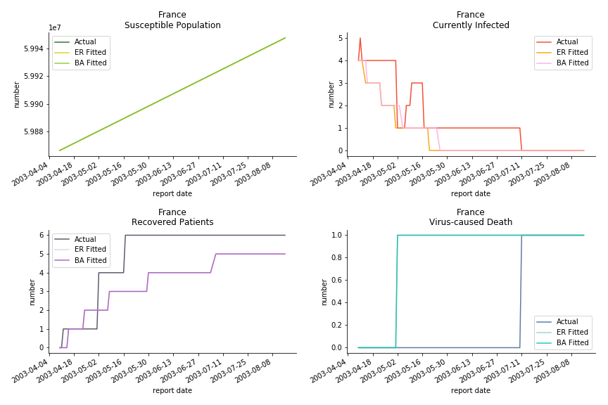
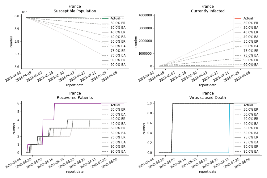
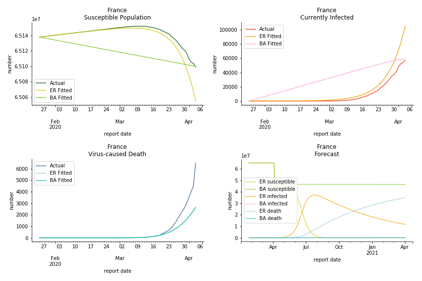
The only country we test for EMEA region is France. As shown in the figure below, the dynamic system works quite well in general. The underlying δ stays at the range from 2% to 3%. It is rather consistent across different countries. The basic reproductive ratio R0 is about 0.6 which is aligned with other countries.
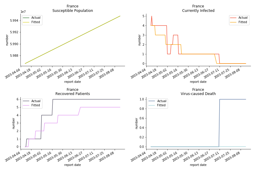
Okay, now comes the real deal, out-of-sample data. The result is quite the same as Gompertz curve. Using only a small percentage of the data is often an overestimation except for one country. Anglo-Saxion exceptionalism is something we hear all the time. Nevertheless, Francophonie exceptionalism in epidemic modelling is really astonishing!
Before we move onto the novel corona virus, you may ask me why we don’t test the global impact this time. Regrettably, the biggest trouble is to get a pair of initial values for the function to converge. I tried a 10k random number simulation. My machine kept working all night long while I was dozing off. Yet, the result still brought no morning glory to me. If you have found a great choice, be sure to let me know!
The case of novel corona virus has much more issues with the data. Given the fact that the event is not far from the beginning, there are few cases where the patients are fully recovered. I cannot accuse WHO of limited data variety and length. Hence, our SIR model must be simplified into SI model. In SI model, we cannot simulate the recovered patients. Once you get infected, the only way out is to kick the bucket. As unscientific and unethical it sounds, it is the only feasible model at the moment.
The consequence of the model switch is also severe. The underlying β is likely to be exaggerated because we don’t have recovered patients in the system. R0 is going to be upward biased. The increase in δ shall offset the vanish of ε in the denominator but the underlying β in the numerator will lead to an increase.
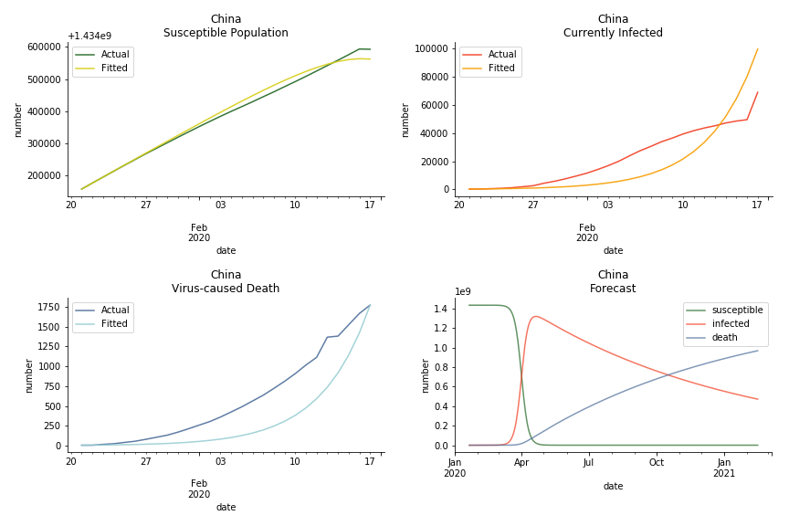
The overnight jump of clinical diagnosed patients on February 13th, 2020 really distorted the whole model (top notch data quality from China as always). The daily fatality rate δ is only 0.3% despite being amplified by the hidden recovery rate ε. With that being said, novel corona virus is indeed a gentle killer. Nonetheless, R0 for China is shockingly 63.3!! With that basic reproduction ratio, the mad spread of the disease can easily wipe out more lives than SARS. If you look at the bottom right, the balance state indicates only very few people will stay uninfected in the end. Luckily there are hidden factors we ignore. One is the lack of the recovered patients R. The other is the lockdown of several regions which greatly reduces the underlying S (with sufficient data we can construct SEIR model to monitor the exposed population E). Otherwise, this is not an epidemic outbreak, it is a bioweapon in Racoon City.
The data of Hong Kong and Singapore is like quantum entanglement. The underlying δ for both are 0.5% and 0.4% where there is a confirmed death in HK. In that sense, we can assume the daily recovery rate ε for both city states should converge to 0.4%. This is based upon the assumption that no death has occurred in Singapore yet and both city states are homogenous. On the contrary, the underlying ε for SARS ranges from 3% to 10%. As in the early stage, no effective treatment has been found. 0.4% sounds like a reasonable number. The R0 for both are 41 and 57 which seems a bit dramatic. As stated by Wikipedia, the current estimate of R0 is about 1.4 to 6.6. The prophecy of the crystal ball is that the susceptible population S could plunge like freefall in mid-March and infected population I could peak in mid-April. Well, this is purely based on the assumption of no recovery and no government intervention.
In North America, the numbers look more reasonable. The underlying δ is 4% for Canada and 2% for U.S. But the death still hasn’t knocked on their doors. Does it mean the potential daily recovery rate ε is about 3%? R0 for both are 4 and 8 respectively which echoes the result from Wikipedia. The crystal ball is hard to tell. A much smaller R0 still doesn’t protect the majority from the virus. Things could get worse in June and peak in July. The good news is, unlike the previous three countries in Asia, the peak of the infected number I doesn’t converge to the susceptible exposure S. My interpretation is that the death toll D is more likely to be the number of recoveries R.
ASEAN countries show similar properties as North America. The underlying R0 for Viet Nam and Malaysia are 6 and 7. They fluctuate around the upper bound of Wikipedia forecast. Supposedly this could be the real R0 for novel corona virus. Daily fatality rate δ for both are 2% with no actual casualty. This further confirms our speculation of 3% daily recovery rate ε.
The last case is France with δ at 2% and R0 at 4. The numbers don’t tell anything interesting but France always surprises me. The first virus-caused death in Europe speaks a lot about the local health infrastructure.
One of the most prominent features of the projections above is the susceptible population S will fall to the very low eventually (the reasons behind were explained earlier). This reminds me of the article on Feb 13th, 2020. A WHO adviser claimed two-thirds of the world’s population could catch the virus. At first, I laughed it off. I mean, dude, come on? When I finished the dynamic system, I ain’t laughing any more. Without global collaboration and transparent governance, the likelihood of the extreme scenario is pretty high.
There is another common feature among the projections above. All the fitted infection numbers overestimate the situation. Is the model being too pessimistic? From our previous study on SARS, we always observe an overestimation in the early stage of 30% or 40% training data. Except on novel corona virus, Gompertz curve done on February 1st, 2020 underestimated all the numbers. Right now, we should be very cautious with the result. Next thing you know, this shitstorm may turn to a pandemic outbreak.
Recently I have been reading a lot of speculations about the source of the virus. Bats, snakes or pangolins? No. The source of the virus is human. These animals have existed in this world long before us. Bats have carried numerous pathogens for several million years. It was us who destroyed their natural habitats and drove them into a closer interaction with human. We need to blame human activities for the emerge of the novel corona virus. Can we blame Uranium-235 for what happened in Chernobyl?
This chapter is finished on February 18th, 2020. No further updates.
Agent-based Model
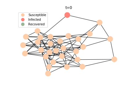
Dynamic system is a very powerful tool. It was developed almost a hundred years ago, and today it still remains popular among epidemiologists. Nevertheless, dynamic system requires a homogeneity assumption of the population. Each individual in the system is regarded as equal and interchangeable, implying that any two individuals can interact with each other with the same probability. In the real world, each individual’s likelihood of infection is constrained by her/his geolocation and social circle. In an extreme case, an indigenous family living in Amazon rainforest is unlikely to interact with a Jewish family living in Caucasus mountains. Hence, the papers on influenza and tuberculosis have a new contestant for the last two decades, graph theory.
Amid the sharp rise of the computing power, we are able to leverage the agent-based model to keep surveillance on each individual. As big-brother as it sounds, the governments across the world have deployed draconian measures to combat the novel corona virus. Our cellular GPS signals, credit card bills and other personal information are used to construct agent-based models. If they keep depriving us of our personal freedom after the virus, we will soon live in an Orwellian dystopian world.
For someone like me, for whom freedom of movement was a hard-fought right, such restrictions can only be justified by their absolute necessity.
--- Angela Merkel, Chancellor of Germany
Despite the long history of graph theory (Euler developed it in the 18th century), its application on epidemic dynamic is a piece of cutting-edge technology. Much work still needs to be done. The model we are going to use is called edge-based compartmental model which was introduced by Joe C. Miller in 2017, less than 3 years ago. You may call it the academic frontier. As exciting as it sounds, the flipside of it is many errors and flaws of the model haven’t been explored properly. It will possibly stay this way for another decade.
There are plenty of existing available models to simulate the epidemic process. Our selection criteria of the model are simple, time complexity. Agent-based model requires fewer assumptions than dynamic system and allows us to test different scenarios, but it comes with a heavy price. As both accuracy and model complexity increase, unavoidably the time complexity shoots through the roof, quid pro quod. Unless you are in a research facility with super computers, any model you run is likely to consume a lot of your Friday booze nights. Mark Newman has introduced pair approximation and degree-based approximation in the textbook of graph theory. Sadly for SIR model, pair approximation requires 3*K^2/2+3*K/2+1 equations in the system, where K is the total number of distinct degrees. Degree-based approximation 2*(M+1)^2 equations in the system, where M is the maximum degree. In comparison, edge-based compartmental model only requires 2 equations for SIR model. In our system of SARS, we only need an extra one for the virus-caused death. The definition of the variables in the equations has slightly changed. In the previous deterministic system, the daily infection rate denotes the ability of all the infected patients to pass the disease to the susceptible population. In a random graph, the daily infection rate denotes an individual’s ability to pass the disease to another individual connected to her/him. The same applies to daily recovery and fatality rate. As usual, all variables take the form of extensive variables.
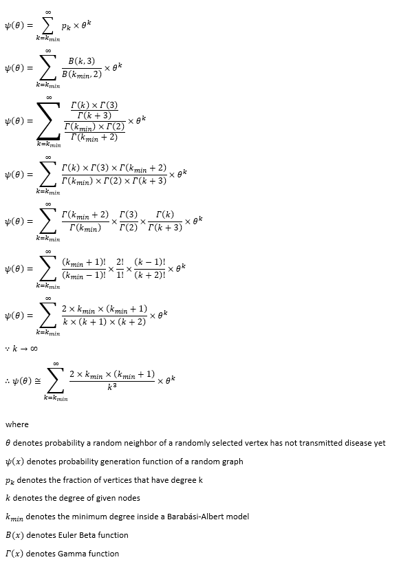
The key variable in the system is θ. Let’s select a vertex randomly from the graph structure. θ is the probability that a random neighbor of our selected vertex has not transmitted disease yet. θ can break down into 4 different parts ΦS, ΦI, ΦR and ΦD. They all denote the probability that a random neighbor of our selected vertex has not transmitted disease yet even though the neighbor is in a given state. For instance, ΦS denotes the probability that a random neighbor of our selected vertex has not transmitted disease yet while the neighbor is still susceptible.
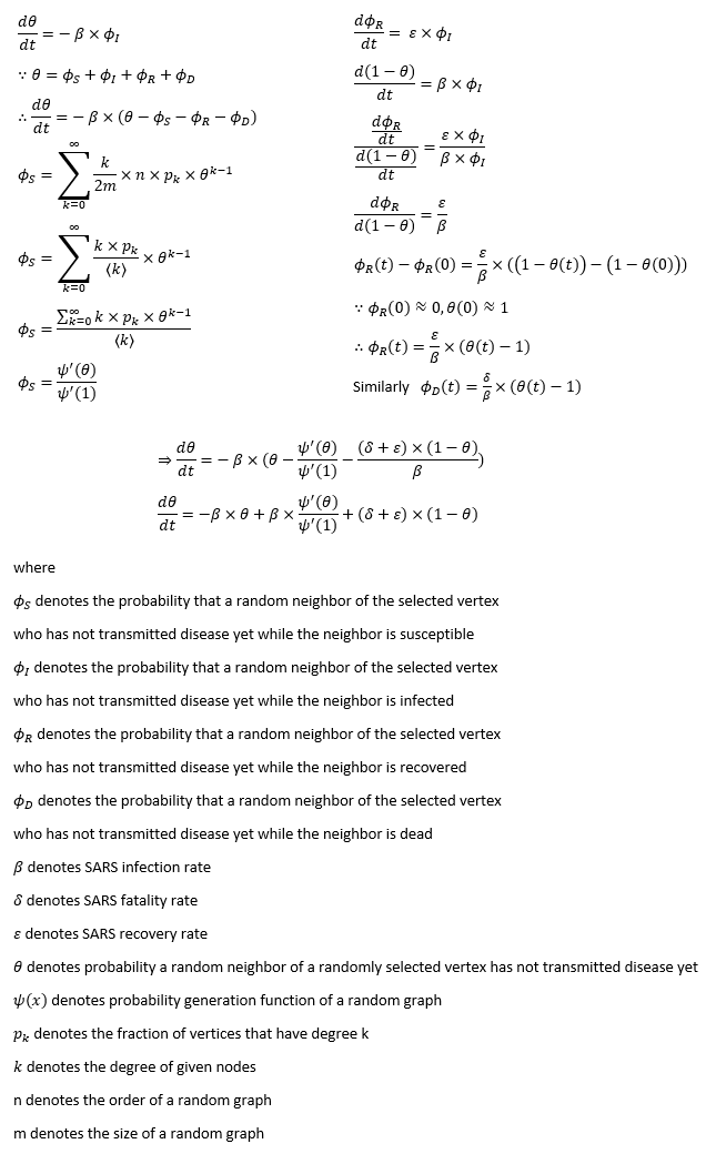
It is quite intuitive that the change of θ is determined by the infection. None of the susceptible, the dead or the recovered can transmit the disease. We can see that dθ/dt decays at the infection rate β with proportion to ΦI. Yet there is no explicit way to compute ΦI. We intend to replace ΦI with θ-ΦS-ΦR-ΦD.
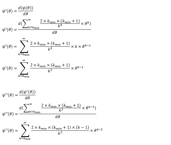
ΦS composes of two elements, the probability a randomly selected neighbor has degree k and the probability of a vertex is susceptible. The probability a randomly selected neighbor has degree k equals to the probability of degree k at any particular vertex times the total fraction of vertices with degree k. The probability of a vertex is susceptible can be considered as all the neighbors of this vertex haven’t transmitted the disease, which is equivalent to θ^k. Remember that ΦS is actually a probability of a randomly selected neighbor. One of the neighbors of the selected neighbor is the initially selected vertex. So we use θ^(k-1) instead. With some transformation, we can convert the computation of ΦS to the expression of the first derivative of probability generating function.
The derivation of ΦR is slightly trickier. We should see that dΦR/dt decays at the recovery rate ε with proportion to ΦI because infection is the only thing has impact on the recovery. As previously stated that dθ/dt decays at the infection rate β with proportion to ΦI, d(1-θ)/dt is supposed to be the same except for the change of the direction. Now we have dΦR/d(1-θ) changes at the ratio of ε/β. Next, we expand the definition of the differentials. Initially θ and ΦS are approximately 1 and the rest of them are closer to 0 since only a tiny part of the population is infected at the beginning of a disease. After some substitutions in the algebra, we obtain the expression of ΦR. We can obtain the expression of ΦD by the same methodology as well.
Now that we have derived the expression of θ, let’s get back to the original system. Unlike the previous compartmental model, we do not need the differential equation for the susceptible exposure S. The underlying S consists of two components, the total population N and the probability generating function of a random graph ψ(θ). As for the infected population I, we cannot have an explicit equation for it. It can only be calculated via other known variables, N-S-R-D. The recovered patients R, the virus-caused death D and the overall population are aligned with the previous compartmental model.
The legitimacy of edge-based compartmental model cannot survive without two essential assumptions. One is neighbor status independence. Assume we randomly select a vertex ι and ι has two neighbors, κ and λ, we ought to forbid the dependency of κ and λ. If κ can pass the disease to ι and ι can pass the disease to λ, it will violate the assumptions, so no disease transmission from ι is allowed. Apparently ι cannot pass the disease to others before infection. After ι gets infected, the odds of recovery or death will not move a decimal. It is easy to see that neighbor status independence guarantees the successful calculation of ΦS, ΦI, ΦR and ΦD. The other assumption is the deterministic performance. The infection, recovery and fatality rate equal to the fraction of the infected, recovered and dead in the overall population. As long as this assumption holds, we could shift our emphasis from the overall population onto the individual. More details of edge-based compartmental model can be found in appendix of this paper.
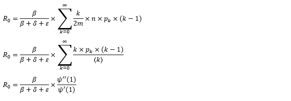
Since we have migrated our system to the random graph, the basic reproduction ratio should change accordingly. The computation involves three parts, the probability a vertex infects a neighbor prior to recovering, the probability a randomly selected neighbor has degree k and the number of the susceptible neighbors. The number of the susceptible neighbors is somehow k-1 instead of k. The logic behind it is one of the neighbors is infected and transmits the disease to the vertex. That’s how the vertex can pass the disease to other adjacent vertices. Although it makes sense, we cannot help to wonder who is patient zero and how patient zero gets the disease. It’s the same skepticism that questions the big bang theory of the universe, how exactly the singular point is created.
The objective of the system is to estimate the unknown with the known so we can make a forecast. The process of agent-based model is pretty much the same as the dynamic system except for the core of the system, θ. To obtain the value of θ, we need the other core, the probability generating function of a random graph. In this project, we propose two common graph models, Erdős-Rényi model and Barabási-Albert model.
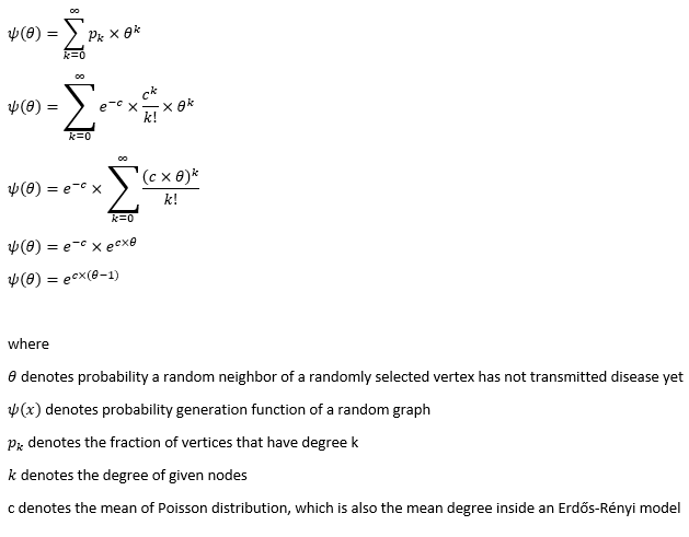
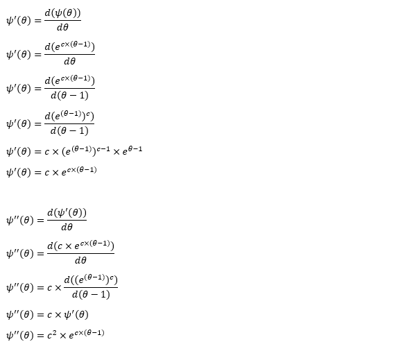
Erdős-Rényi model is the simplest form of a random graph. The edge between each pair of vertices depends on a common Bernoulli random variable. The generation of each edge is independent which yields a binomial distribution. As the number of vertices converges to infinity, Erdős-Rényi model converges to Poisson distribution. The greatness in Poisson distribution is its probability generating function can be expressed in closed form.
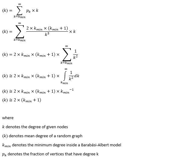
The mean degree of the model requires some bold assumptions to go ahead. As the random graph is a mathematic representation of the social network in real life, mean degree stands for the average number of contacts per capita. Anthropologists suggest Dunbar’s number, 147.8 (150 for rounding). Robin Dunbar studied the causal relationship between social grooming time and social group size. He compared the neocortex ratio of 🐒 🦍 with 🙎 to obtain the number. Another one is Killworth-Bernard number, 291 (300 for rounding). They collected telephone survey data and compared the response with US census. They used a scale-up method in statistics to estimate the number of contacts of survey respondents in specific subpopulation and particular relation categories. For example, the answer to the question of “how many Christina you know” compares with the percentage of registered US residents called Christina. Furthermore, European epidemiologists conducted a survey in 8 different states inside EU. They concluded the daily contact number per capita is 13.4 on average. Their definition of contact is either physical contact (e.g. la bise) or face-to-face conversation with more than two words. German participants reported the fewest daily contacts and Italians had the highest number. Perhaps this explains the epicenter in Italy and low death toll of corona virus in Germany.
Well, none of these numbers really work for us. Killworth-Bernard number may turn out to be too large as we don’t have physical contact with every friend of ours every day. 13.4 may be too small. We don’t need physical contact or face-to-face conversation to pass on the disease. A simple sneeze can produce respiratory droplets to infect people within the radius of 2 meters. For the moment, let’s ignore the contaminated surface. We solemnly focus on the daily contact.
Imagine an average middle-class wife Jane Doe. She lives in Royal Victoria E16 and works in Canary Wharf E14. Every morning she has to physically contact her husband John Doe and their two kids. Later she takes DLR straight to West India during peak hour. How many people can she contact through commuting? US CDC recommends social distancing for 6 feet/2 meters at minimum. Assume the area of π2^2 square meters is a contact zone, how many people can we squeeze into this area? Let’s take a peep at average European clothing size. The hip girth should be considered as the largest part of your body dimension. The most detailed size chart on Wikipedia is the German one. The hip circumference of a medium German person regardless of gender is about 105 centimeters. Imagine the hip in round shape, the diameter is roughly over 30 centimeters. Consider the backpack/handbag and the layers of winter clothing, each person takes the area of 50 by 50 square centimeters. It’s difficult to fill a square area into a round area so we convert π2^2 square meters into 13^0.5 times 13^0.5 square meters. With each person has approximately 50 centimeters’ distance to another, we can fill 16 people including Jane Doe within the radius of 2 meters. It is completely possible during peak hour. If Jane Doe is a virus carrier, she can easily infect 30 people through commuting from/to work. Note that we are using European clothing size, if we use American one, we will probably end up with half of the result 😂
Once arrived at the office building, she needs to take the elevator/lift to her floor. On average, the capacity for a ThyssenKrupp is about 8 to 12 people. But hey, people working in Canary Wharf can’t get squeezed like canned sardines. Call them snobbish if you want. From my experience, more than five people is called crowded. In and out of office plus twice for lunchtime, Jane Doe has contacted 20 people in one confined space alone. When she is in the office, an open-plan office (everybody hates it) is a nightmare to keep social distancing. A normal day at work should leave at least 30 people at exposure assuming she doesn’t take up a client facing role. We are talking about meaningless conferences, awful hotdesking and tiny cubicles. Working from home doesn’t seem so bad now. At lunch time, she goes to Tesco in One Canada Square for 3£ meal deal (this is not the continent, no 3-course meal plus Tuscany wine for your average lunch). It’s easy to contact 5 people in the fridge area since everyone is looking for the perfect chicken BLT. Lining up for the queue gets at least two people exposed, the one in front of you and the one after you. Usually there is an assistant to direct you to the right counter. Say Jane Does pays at the machines, the people to her left and right are also within the radius of two meters. Alternatively she can go to Vietnamese food truck for pho and spring rolls. Either way, the queue at lunch hour can contribute at least 10 contacts. Besides, she goes to Waitrose after work to purchase ingredients for the dinner. She doesn’t eat out often because of the crazy expense of the rent and monthly zone 2 pass. Using the same logic above, she has contacted 20 people at different supermarkets every day. In addition, she goes to crossfit or yoga class after dinner because of the peer pressure from colleagues. Obesity is a sign of laziness in Canary Wharf. Eight or nine PM is a peak hour at gym so another 10 contacts can be made. Before a day passes, Jane Doe has 3+15+5+30+5+10+5+5+10+15+10 contacts. We take a rounding to 120 because there can be some miscellaneous contacts. For instance, her team may maintain a tradition of going to pubs for happy hour every day or she has a date night with her husband at Covent Garden every Thursday.
After we set the tone of the mean degree, things get easier. Erdős-Rényi model is mathematically viable. The probability generating function yields a closed form. The degree correlation is very low so it suffices the neighbor status independence of edge-based compartmental model. Nonetheless, it fails at only one critical point, the real social connections don’t follow Poisson distribution. The empirical study suggests that some social connections follows asymptotic power law distribution, which brings us the configuration model with preferential attachment mechanism, Barabási-Albert model.
Barabási-Albert model is a special case of Price’s model. Each vertex inside the model is guaranteed to have the minimum degree. Each new vertex added into the graph has higher odds connecting to existing vertices with large degree. In that sense, the early birds get worms. The earliest vertices usually have the largest degree. Assortative mixing is a debatable topic for scale-free models. Barabási-Albert model is supposed to have neutral degree correlation. Don’t take my word for it. Signore Barabási wrote the material for his own network science class.
As previously stated, the mean degree is set to 120. The mean degree of Barabási-Albert model is dependent on the minimum degree. Under the condition the minimum degree is far smaller than the maximum degree, we can use Riemann integral to prove that the mean degree is nearly twice as large as the minimum degree. Obviously, we set the minimum degree to 60.
The biggest hurdle of Barabási-Albert model is its probability generating function. Unlike Erdős-Rényi, we cannot obtain a closed form. Don’t forget we need the probability generating function to obtain θ. To get around with the obstacle, we need to slightly modify the upper bound of the degree. The largest degree inside a random graph cannot exceed its number of vertices. That is still not very helpful. Consider the population of Italy is 60 million, the computation burden of probability generating function still exists. There must be a limit to daily contact. There are only 86400 seconds within a day. If a person is able to meet 15 different people within the contact zone every second, the maximum number is merely over 1.3 million. Moreover, I don’t believe anyone can contact one million different people in a day. 1.3 million is about the population of Zurich. Can anyone really meet every citizen in Zurich in one day? Assume you work 12 hours per day including commuting, you meet a new customer every 45 second, you end up with 960 daily contacts. Let’s accept this number and take the rounding to 1000. One thousand is defined as the upper limit of the daily contact. The probability of a vertex with degree 1000 is 7.32e-06, a number we can basically ignore. Limited to 1000, we are able to treat the probability of a vertex with degree k as the coefficients, θ^k as the unknown. We can obtain the value of θ via finding the roots of polynomial equations.
There are other plausible models, like Bianconi–Barabási model and Watts-Strogatz model. As a matter of fact, Ginestra Bianconi used to teach in my university even though we never met. I don’t really have enough confidence to say I fully understand that model. Bianconi–Barabási model is a variant of the Barabási–Albert model which the latecomer can gain an advantage as well. Watts-Strogatz model can capture the small world effect but the issue is its probability density function. It is in the form of Dirac Delta function and it cannot be expressed in closed form. It will ridiculously increase the time complexity of our project.
Edge-based compartmental model we mentioned earlier works on static models. The bad news is the real world is always chaotic. We don’t really meet the same group of people every day. The meta population model sounds closer to the reality. To incorporate this effect into the model, we may end up with a lot of extra dimensions in the system. For the sake of time complexity, we assume every agent in the system lives in a Truman’s show. Each agent meets the same group in the same location with the same routine every day. Another problem is the population growth. On average, the annual population growth in EU is about 1%. If we convert it to a daily rate, the number is 2.7e-05, so small that we choose to ignore its impact on the probability generating function. It is unlucky for an infant to crawl out of the womb during the pandemic outbreak but what doesn’t kill you make you stronger, right? Theoretically a newborn child should only have two connections, mama and papa. At maximum, a newborn child can inherit all the connections from the parents, e.g. the father goes shopping for grocery while carrying the baby. We take the latter approach so we don’t have to face the consequences of a dynamic variable-degree model. As for the dead and the recovered, they remain inside the model with their edges except they don’t really interact with the susceptible and the infected.
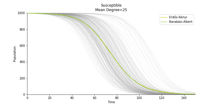
In terms of the degree distribution, Barabási-Albert model demonstrates a longer tail than Erdős-Rényi model. With the similar mean degree, Barabási-Albert model doesn’t have the same level of concentration at the mean degree.
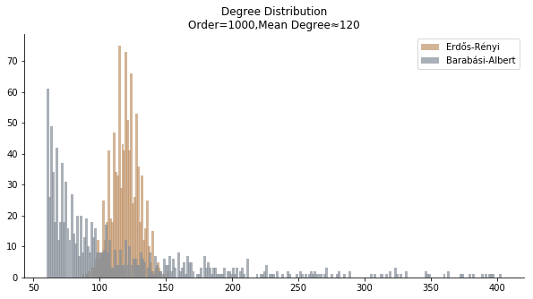
In the time dependent process, we do not observe any different behaviors between two models. To simulate the epidemic process, we utilize Gillespie algorithm. It is capable of statistically correct simulation of each individual at each discrete step with respective to the underlying equations. We set the graph order fixed at 1000. Each time we only increment the mean degree by a small degree. We test a hundred times for both Erdős-Rényi model and Barabási-Albert model. Since the recovery and the fatality has nothing to do with the degree, we merely keep an eye on the susceptible. The result comes as a surprise. The susceptible doesn’t take a dip when the mean degree monotonically increases. It is very counterintuitive as the implementation of social distancing and quarantine is the best way to shift the curve downwards. The phenomenon could be attributable to the stochasticity of the model or the low infection rate we preset.
Let’s look at in-sample result of SARS. The comparison between the results of differential equations and random graphs is quite intriguing. In general, the basic reproduction ratio of random graphs is, to some extent, larger than the R null from differential equations. The R null of Barabási-Albert model is a strange case. The number lingers around 1.63 across different locations. The number is larger than one yet we do not observe any surge of infection number. The infection rate β of random graphs is largely greater than differential equations. It is owing to the fact that β switches to the prospect of infection among individuals in random graphs. The underlying β of power law distribution is always several decimals larger than the one of Poisson distribution. As the standard deviation of power law distribution is way bigger than Poisson distribution under the same mean, most individuals in Barabási-Albert model have fewer daily contacts than individuals in Erdős-Rényi model. The underly β is forced to compensate such a variance.
The fatality rate δ is consistent between differential equations and random graphs. Yet the recovery rate ε is a huge pain in the ass. For Hong Kong, Singapore, Canada and Malaysia in random graphs, the underlying ε is almost zero. As it turns out in our samples, the fitness of recovery is incompatible with the fitness of infection. We either choose an explosive number of infections to satisfy the proper number of recovery or a stagnant number of recovery to meet the declining number of infections. It doesn’t indicate the model is problematic though. It has more to do with the faulty data. The infection number is always underestimated. People with mild symptoms don’t get tested for the virus so we never know the true scale of the epidemic. For US, Vietnam and France, the underlying ε is consistent between random graphs and differential equations. The data in these places may accurately record the event of epidemic outbreak.
For the out-of-sample estimation, the early-staged overestimation of the infection is shared across all methodologies. Especially for Barabási-Albert model, it is more like a worst-case scenario compared to Erdős-Rényi model. Nevertheless, the estimation of the fatality in the early stages seems to be somewhat accurate, if not underestimated, in contrast to differential equations. The recovery estimation is disregarded given the poor performance of the in-sample estimation.
It has been more than two months since WHO issued the first situation report of COVID-19. I don’t know what people put in 🦇 soup but nobody has foreseen this catastrophic pandemic. The novel corona virus has ruined everybody’s 2020. Eurovision in Rotterdam, Festival de Cannes, Olympics in Tokyo, almost everything is cancelled or postponed indefinitely!!! Everybody is 😠 😟 and 😭 while on house arrest. Our early models, both non-linear regression and dynamic system, failed to predict this situation but it did provide us with a glimpse of what could possibly happen. Could agent-based model do better?
Similar to differential equations, we remove the recovery from the model for COVID-19. So far, there is only one data source offering daily recovery, Worldometers. It doesn’t reveal its data source and WHO doesn’t include the recovery at the moment, so the data still comes from the poor format of WHO situation reports. John Hopkins University has set up web scrapers to extract daily data from Worldometers in case you want to have SIR model on COVID-19. However, I have found a better-structured data source, European CDC. Judging by the format, the metadata comes straight from the database which is handy for any researcher. If you read the instructions carefully, you will see they even feature a tutorial for R. Everybody thought EU was a dinosaur fossil but you never know! Since we have been using WHO for the previous two models, a change of data source has too much sunk cost so let’s stick to WHO for the moment.
The same issue from differential equations persists. Without daily recovery rate ε, the only way out of the infection is decease. The basic reproduction ratio is fairly revised as well.
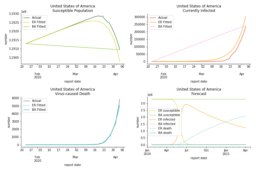
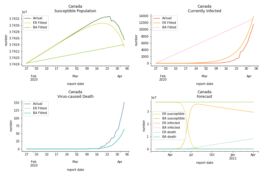
The result of COVID-19 is very troublesome. Literally every country on the planet has suffered from the pandemic. Given the workload of running model on every country, we only select two or three countries from each region. Let’s start from North America since U.S. is leading the infection number. The fatality rate δ for the Yankees is 0.3% no matter the form of probability generating function. The infection rate β across two different distributions have a large gap. The infection curve from Erdős-Rényi model shows a trait of exponential function and the infection curve from Barabási-Albert model is more like a linear equation. As a result of a larger underlying β, the basic reproduction ratio of Erdős-Rényi model is 30.3, way larger than 1.8 from Barabási-Albert model. Canada has smaller fatality rate and infection rate as its fatality curve is underestimated. Nonetheless, Canada has a higher R null from both models, 64.1 and 2.0.
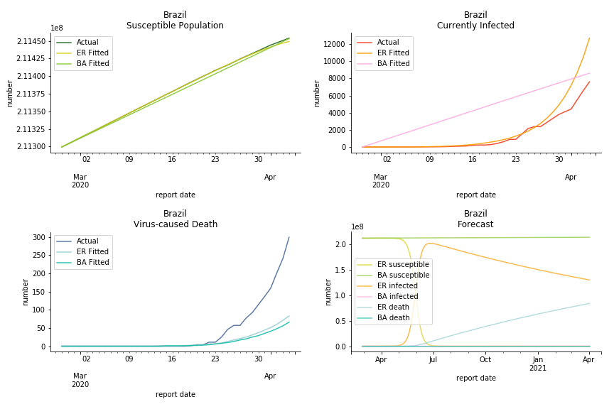
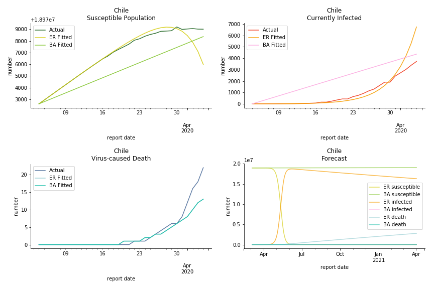
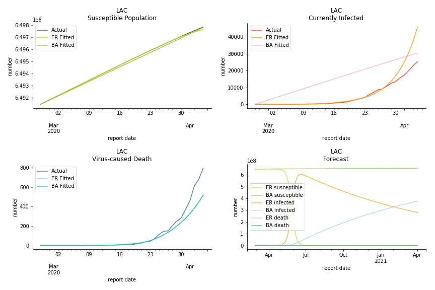
Latin America and Caribbean has a less severe situation than Uncle Sam. Brazil, the most populous nation in South America, has a fatality rate at 0.2%. However, we should take caution with this number as the fatality curve has been underestimated. The underlying β is also lower than U.S. but higher than Canada. The basic reproduction ratios for Brazil are 58.7 and 1.7. The situation of Chile is pretty much the same. The Chilean R nulls are 96.2 and 2.5. We also take a look at LAC region as an aggregation. The aggregation is defined by UN geoscheme. The underlying δ across the region is about 0.3%, similar to United States. The R0s are 44.8 for Poisson distribution and 1.7 for power law distribution.
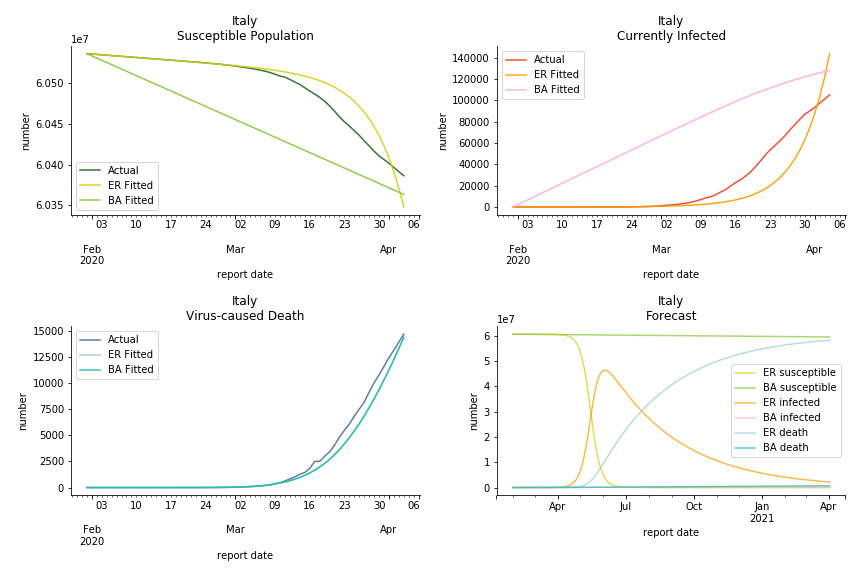
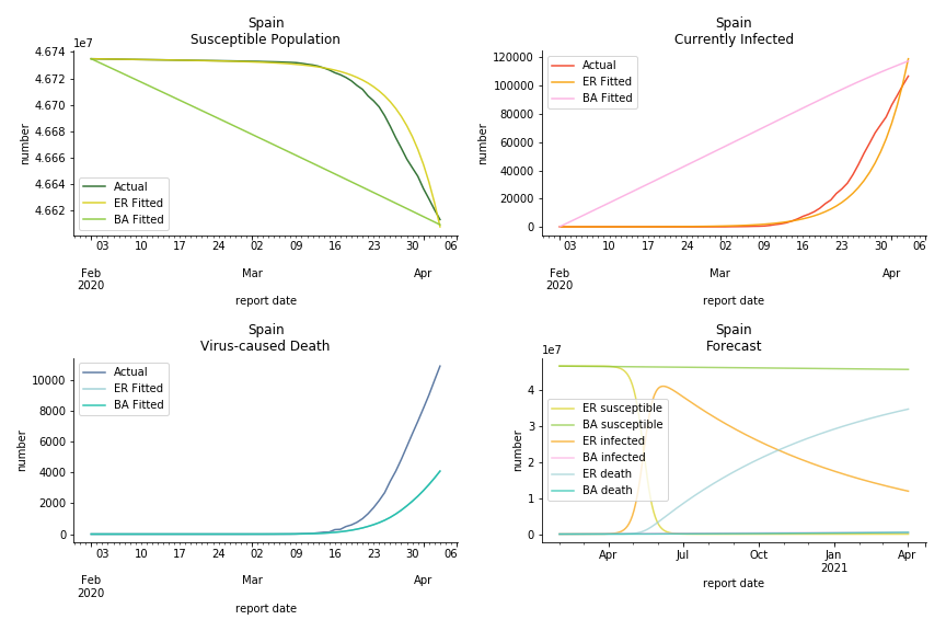
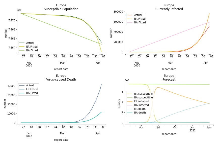
The current epicenter of the world, Europe, has a huge problem. Italy, one of the first countries that suspended flights, somehow suffered the most. It has the oldest population after Japan so its fatality rate is sky high, 1%. The underlying β is also larger than any other countries in our sample but the basic reproduction ratio from Erdős-Rényi model is 14.3, much smaller than others. R null from Barabási-Albert model is quite in line with others, 1.84. Forza Italia! Spain, with its underestimated fatality rate at 0.4%, is catching up with Italy. Its cumulated number of cases has already surpassed Italy. The underlying R0s are 29.4 and 2.2 respectively. ¡Vamos España! France has a moderately better situation than Italy and Spain. Given its geolocation in the middle of Italy and Spain, let’s hope it will stay this way. Its underlying δ is 0.5% and its basic reproduction ratios are 22.4 and 1.8. Courage France! After that, we look at Europe as a whole. The definition of Europe is EU27+EEA+Switzerland+some pending members in Balkan peninsula. Oh, what about a nation which is not in Schengen area and Euro zone and withdrew its EU membership several months ago? I am kidding, the definition of Europe includes everyone on the continent, islands plus Ukraine, Moldova and Russia. The fatality rate of Europe is about 0.2% as a whole. The R0s are 39.3 and 1.9.
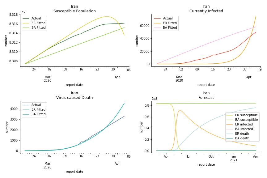
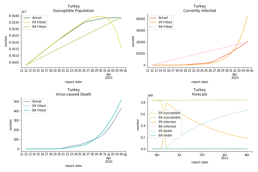
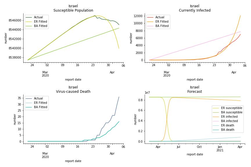
It was quite a shock when I first heard Iran had a jump of cases. If corona virus can spread to a place with limited traffic to the rest of the world and ongoing sanction, where else is immune? Its underlying δ is 0.7%, closer than anyone to Italy. Its basic reproduction ratios are 25.1 and 1.8, still closer than anyone to Italy. People are saying Tehran has distorted the reported number so the situation is far worse than it appears. It is quite worrisome providing Iranians’ ability to acquire medical equipment has been crippled by years of sanctions. As for Turkey, its fatality rate is about 0.5%. Since no other countries hold more Syrian refugees than Turkey, this is quite concerning. Its underlying R null are 46.9 and 1.8. If I am going to make any forecast, I’d say Israel seems to get out of hand. Its fatality rate is at 0.03% but its basic reproduction ratios are 101.6 and 5.6, larger than any others. If Netanyahu cannot get ultra-orthodox families in check, the crown of the epicenter will fall on Israel for sure. One thing I’d love to mention is the war-torn Yemen hasn’t appeared in WHO situation report. It is impossible that one country can dodge the fate of outbreak while the rest in Middle East cannot.
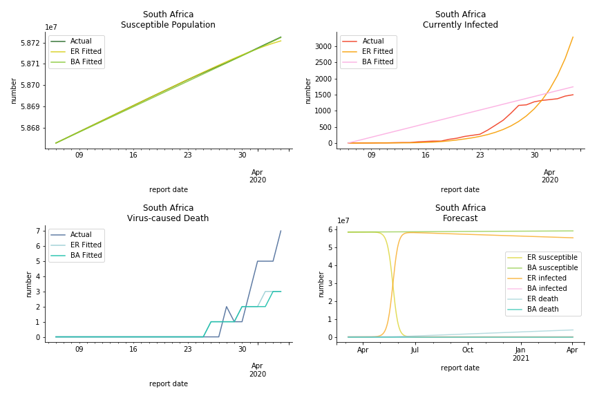
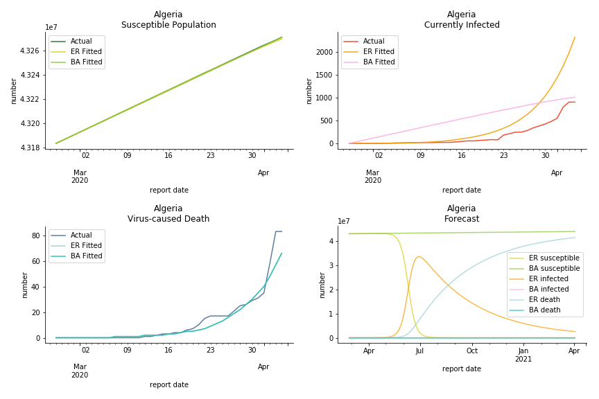
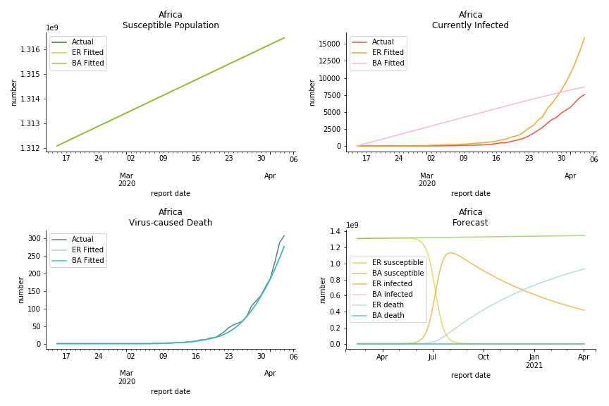
South Africa has one of the lowest fatality rates inside the sample. It is merely 0.02%. Its basic reproduction ratio from Poisson distribution is as high as 107.3 but its R null from power law distribution seems at ease, only 1.9. Algeria is the most severe case in North Africa. Its fatality rate is about 0.9% which is quite high but its R null of Erdős-Rényi model is only 14.8 and its R null of Barabási-Albert model is only 1.6. It sounds like the data is underreporting. The result of Africa leaves people skeptical. Sub Saharan has the least medical facilities to prepare for another outbreak. It still hasn’t really recovered from Ebola. Its underlying δ is 0.4% and R0s are 24 and 1.6. How can they be so low?
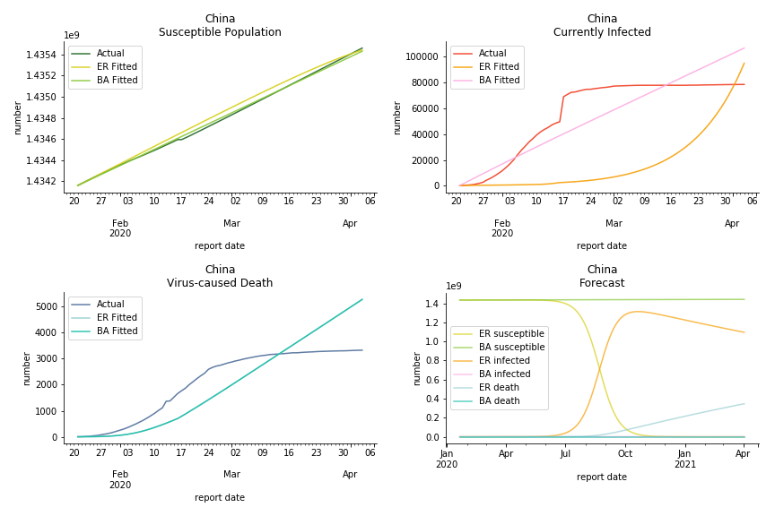
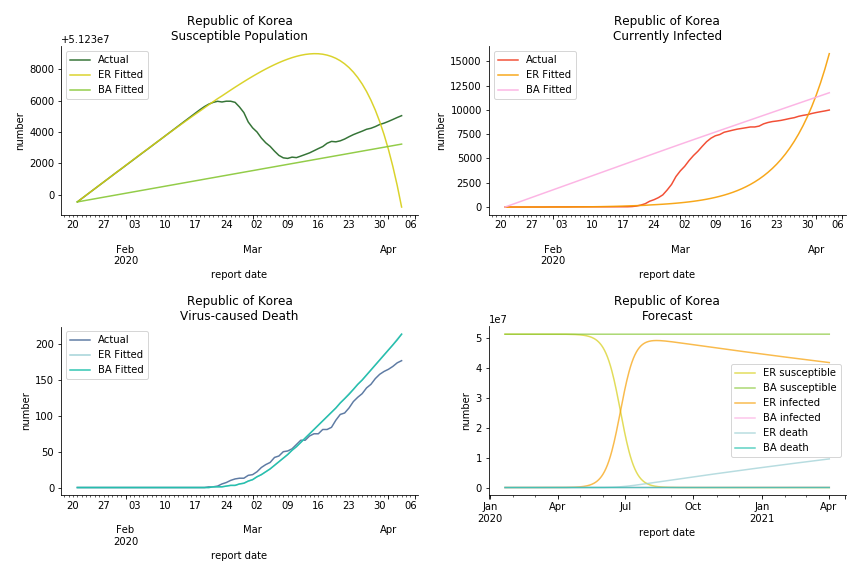
China, the origin of the virus, has reverted to normal. The infection curve seems to be saturated. Without recovery data, it is quite impossible to fit in the model. Its underlying δ is 0.1% and R0s are 39 and 1.6, but does the data tell the real story? South Korea, with the aggressive testing strategy, ends up with low fatality rate at 0.07%. Yet, its basic reproduction ratio tells the whole story. Its R0s are 65.1 and 1.9 We can observe two waves of outbreak from the susceptible curve.
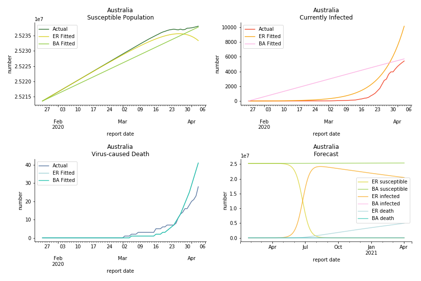
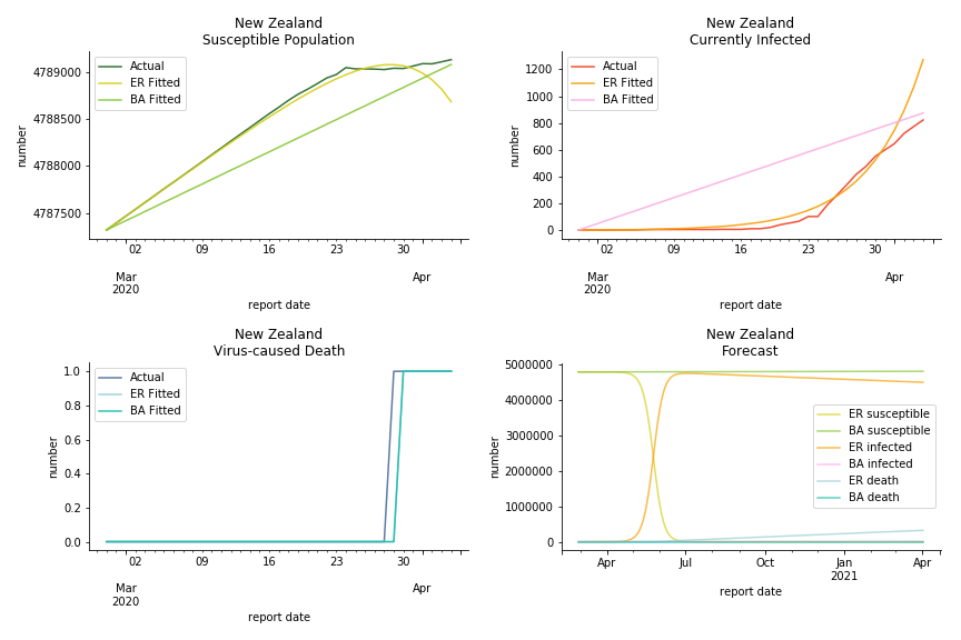
Australia and New Zealand, two countries in Oceania cannot escape the virus in spite of their remote location. Their fatality rates are relatively low, 0.08% and 0.02%. Their underlying R null from Poisson distribution are 62.9 and 104.2. Their underlying R null from power law distribution are 1.9 and 2.9. I cannot tell if Australia is getting things under control but New Zealand is absolutely on the brink of losing it.
In general, the model on COVID-19 is a different beast from the model on SARS. The basic reproduction ratio of Erdős-Rényi model is enormous, somewhere between 40 to 100. The basic reproduction ratio of Barabási-Albert model is swinging between 1.5 and 3, a lot more reasonable. Could 3 be the actual R null for the novel corona virus? The COVID-19 infection rate β is an opposite case to SARS. The underlying β of power law distribution is much smaller than the one of Poisson distribution. Similar to the probability density function, Erdős-Rényi model demonstrates an exponential growth while Barabási-Albert model implies a linear growth. In that sense, the forecast from Erdős-Rényi model turns out to be the worst-case scenario.
The result shows us the novel corona virus is nothing like we have seen before. Any delusion of a normal flu is going to cost many lives. Neither Gompertz curve nor differential equations in the early stage has captured the severity. Unlike the overestimation for SARS, the models constantly underestimate the viral spread. To combat such a powerful yet invisible enemy, what we need the most is solidarity. When Giuseppe Conte first approached to EU for help, ‘ECB is not here to close the spread between German bond and Italian bond’ was thrown to his face. Back in 2015, it was Italy who had to take in millions of asylum seekers from the other side of Mediterranean Sea. Nobody else was willing to share the quota. Again, it was Italy who waived the war debt of Germany and led the prosperity of post-war continent. Now all these bureaucrats in Europe do is to clash over budget deficit and corona bond. EU member states unilaterally closed borders and banned exports of ventilators. Others outside of EU are playing conspiracy theories and blame games to shape their narratives. In a pandemic outbreak, we must stop this every-man-for-himself drama. Virus doesn’t stop at the border.
Some silver linings finally emerge. Infection curve in Italy begins to flatten as we speak. Hopefully in no time we will be sipping affogato at piazza again, eating cinco jotas at cervecería again and carving steep slope at Charmonix again.
Andrà tutto bene.
This chapter is finished on April 5th, 2020. No further updates.
By the time I finished this piece of article, Kaggle has launched corona virus challenge. Since you have read this far, you must be really interested in data science (the math in graph theory could put off many readers), why not take up the challenge? I am no fan of Greta Thunberg and her flygskam but she is right. It’s time for a radical change, even for data scientists. The world doesn’t need more facial recognition or gait analysis experts. The world needs more physicists, geologists, meteorologists, zoologists, epidemiologists, etc. And you can be one of them!
Further Reading
- Barabási A (2014) The Barabási-Albert Model
- Chinazzi M, Davis JT, Ajelli M, Gioannini C, Litvinova M, et al. (2020) The Effect Of Travel Restrictions On The Spread Of The 2019 Novel Coronavirus (COVID-19) Outbreak
- Dunbar R (1993) Coevolution Of Neocortical Size, Group Size And Language In Humans
- Ferguson NM, Laydon D, Nedjati-Gilani G, Imai N, Ainslie K, et al. (2020) Impact Of Non-pharmaceutical Interventions (NPIs) To Reduce COVID-19 Mortality And Healthcare Demand
- Gardner L (2020) Modeling The Spreading Risk Of 2019-nCOV
- Lipsitch M, Cohen T, Robins BCJM, Ma S, James L, et al. (2003) Transmission Dynamics And Control Of Severe Acute Respiratory Syndrome
- McCarty C, Kilworth PD, Bernard HR, Johnsen EC, Shelly GA (2001) Comparing Two Methods For Estimating Network Size
- Miller JC, Kiss IZ (2014) Epidemic Spread In Networks: Existing Methods And Current Challenges
- Miller JC, Slim AC, Volz EM (2017) Edge-based Compartmental Modeling For Epidemic Spread Part I
- Mossong J, Hens N, Jit M, Beutels P, Auranen K, et al. (2007) Social Contacts And Mixing Patterns Relevant To The Spread Of Infectious Diseases
- Newman M (2018) Networks
- Riley S, Fraser C, Donnelly CA, Ghani AC, Abu-Raddad LJ, et al. (2003) Transmission Dynamics Of The Etiological Agent Of SARS In Hong Kong: Impact Of Public Health Interventions
- Tjørve KMC, Tjørve E (2017) The Use Of Gompertz Models In Growth Analyses, And New Gompertz-model Approach: An Addition To The Unified-Richards Family
- Zhou G, Yan G (2003) Severe Acute Respiratory Syndrome Epidemic In Asia
This material was published by Albert-László Barabási. What could be better than learning from the maître himself?
This paper evaluated the impact of city lockdown to combat COVID-19 via global epidemic and mobility model. The methodology of global epidemic and mobility model is here.
This paper studied the causal relationship between social grooming time and social group size. It compared the neocortex ratio of baboons, chimpanzees, gorillas with homo sapiens to estimate the maximum friendships a human can maintain.
This paper convinced UK government to drop the notorious idea of herd immunity. The methodology is in Containing Pandemic Influenza with Antiviral Agents.
This paper used global air traffic data to construct a meta population model to predict the next epicenter. The methodology is in A decision-support framework to optimize border control for global outbreak mitigation.
This paper incorporated latent, quarantined and isolated into SEIR model. It used 9 differential equations to estimate the infectiousness of SARS.
This paper collected telephone survey data and compared the response with US census. It used a scale-up method in statistics to estimate the number of contacts of survey respondents in specific subpopulation and particular relation categories.
This paper summarized strength and shortcomings of each existing methodology to simulate epidemic dynamic. The motivation of using edge-based compartmental model originated from this paper.
This paper made an introduction of edge-based compartmental model. Part II and part III illustrated a more generalized model on both static and dynamic networks.
This paper conducted a survey in 8 different member states inside EU to find the daily contact number per capita. It is widely cited in epidemiology papers.
This is the graph theory textbook read by math graduates around the world. You can find pairwise and degree-based epidemic modelling in chapter 16.
This paper attempted to estimate the basic reproduction ratio of SARS via a transmission model. The model took the form of SIR with latent, hospitalized and dead as bonus.
This paper made introduction to various forms of Gompertz models. It also proposed a unified version of Gompertz model to study organismal growth.
This paper assessed the effectiveness of intervention measures during SARS pandemic via Richard's curve. The authors stated predicting epidemic dynamics on the basis of data from early could have led to untenable conclusions.
Click the icon below to be redirected to GitHub Repository