Reverse Engineering
Table of Contents
Intro
Creating a visualization from data is easy. In Tableau, it's only one click. What happens if you want to extract data from a visualization? A simple google search yields a few reverse engineering tools, yet they share the same malaise – they only work with single curve and require a lot of clicks. This project addresses these issues by incorporating unsupervised learning into image processing. Multiple curves are separated by different color channels with clustering techniques. Data can be easily extracted via computing coordinates of each pixel. A simple conversion from resolution scale to axis scale approximates the coordinates to the original spreadsheet. Voila, no more ridiculous subscription to Statista 😲
Well, that may be a bit exaggerating. According to the second law in thermodynamics, heat naturally flows from hotter to colder bodies unless external influence is forced upon the system (tenet, anyone?). The same applies to our reverse engineering process. The irreversibility in visualization generating process determines that we would never be able to replicate the original spreadsheet. At best, we are only able to replicate the same data in the scale of the resolution. It is a consequence of the asymmetric character of image processing operations. Regardless of its limitation, it is still a great tool to capture the overall trend and rough numbers. Use it when subscription to data provider is not a commercially viable option and the requirement of the precision is of less importance.
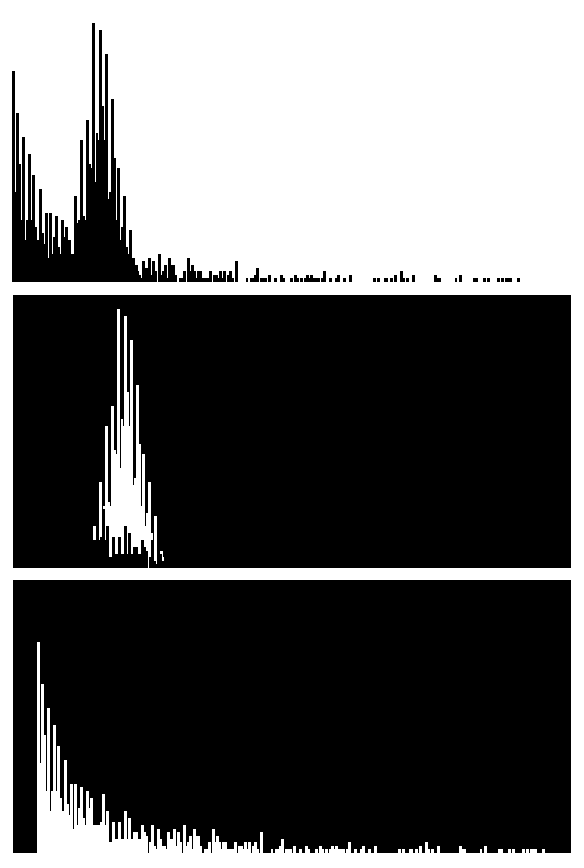
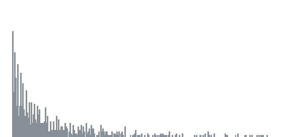
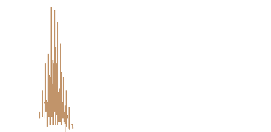
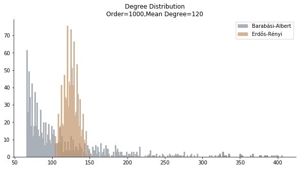
Let’s introduce two guinea pigs of this project, a bar chart and a line chart. The bar chart comes from my Epidemic Outbreak project. It is a degree distribution of both Barabási-Albert model and Erdős-Rényi model with the same mean degree. The real challenge lies at the overlap part of grey bars and orange bars. We need to find an algorithm to separate the grey bars from the orange bars so that we can compute the coordinates of the underlying pixels.
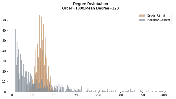
Since we are only interested in the data “behind the bars”, we need to remove the legend, the title and the axis labels. The input should be reduced to an image fitted to the scale of the axis.
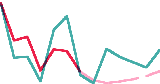
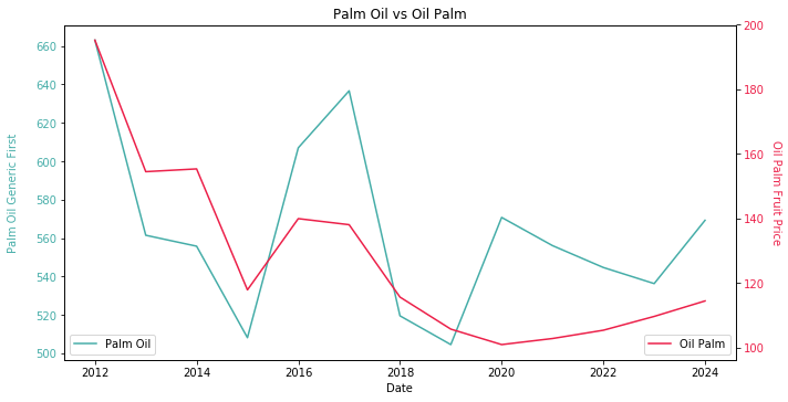
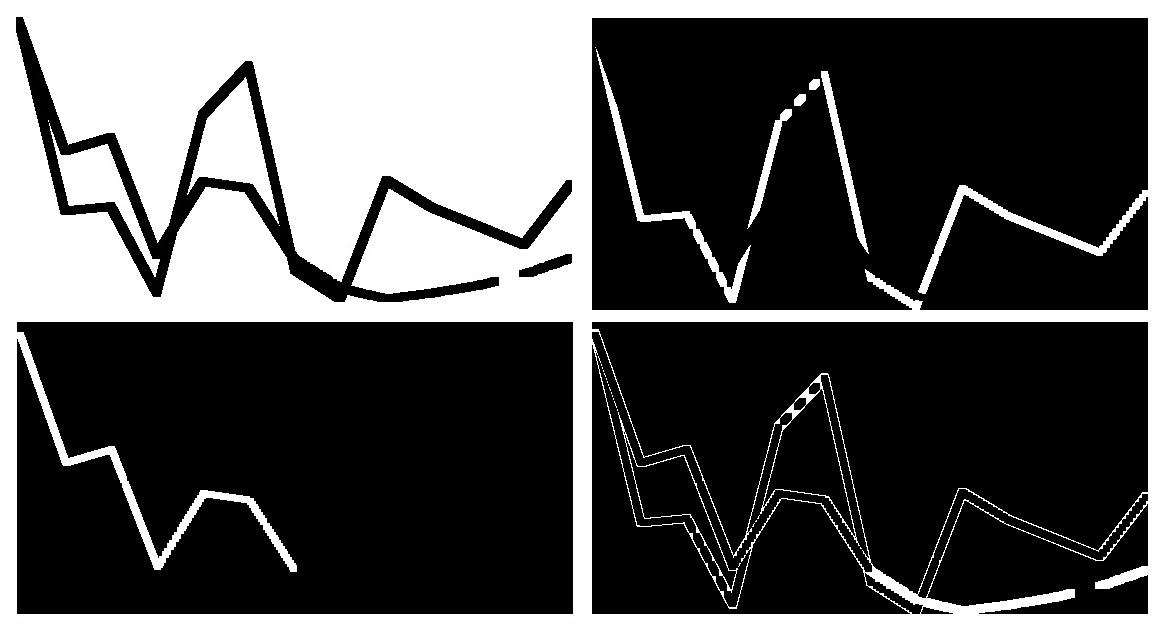
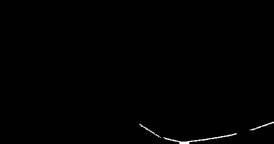
The line chart comes from my Smart Farmer project. It is the comparison between palm oil FFB forecast and palm oil CPO forward curve. The overlap of the lines is no concern, but the tricky part is the dotted line. We need to carefully calibrate the parameters of erosion and dilation algorithm in order to preserve the inclusion of the dotted line. Without delicate balance, the dotted line could easily become noise.
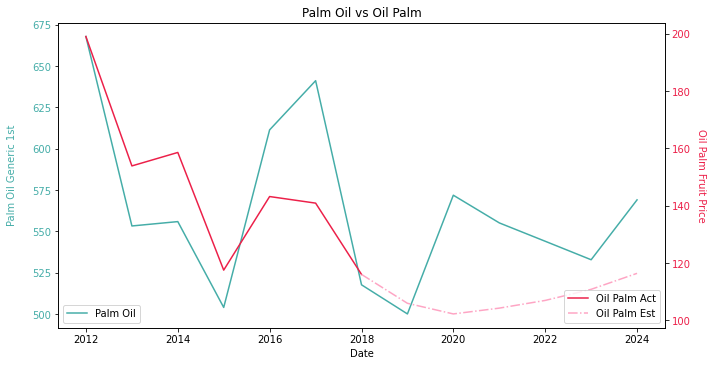
Similar to the bar chart, the line chart has to be cleansed into a purest form without extra information.
We have been taught digital images comprise of many pixels in school. The color of each pixel is represented in RGB values. Each pixel is assigned to a unique position in a 2D matrix with the same size of the resolution. Ideally, the green color in RGB is (0,255,0). A search in the matrix for all the pixels equal to (0,255,0) should yield the coordinates. Palm oil CPO forward curve should be obtained. How I wish it is that easy 😒
The brutal truth is the green color in the line chart can range from (0,255,0) to (20,230,20) or even more dramatic. Eyes of Homo Sapiens are almost at the bottom of the food chain (I would love to see infrared and ultraviolet!). The tiny difference between (0,255,0) green and (1,255,0) green cannot be detected by our humble eyes but machines pick it up effortlessly. Yet, RGB values create 2^24 combinations of colors. Here comes haute couture. How do we separate the RGB colors wisely in order to separate the multiple lines?
Centroid Model
Well, the answer is unsupervised learning. How? This project draws inspiration from question 5 of problem set 3 of Stanford University CS229. If you don’t bother to find it in your course materials, that’s fine. Basically, the problem set attempts to apply K Means to lossy image compression, by reducing the number of colors used in an image. Each pixel in the image is considered a data point in the RGB 3D space. We create a fixed number of clusters and replace each pixel with the closest cluster centroid. Ultimately, we end up with fixed number of colors.
In regard to our project, multiple lines are conventionally rendered in different colors. Same color with different line styles rarely occurs since it’s easy to confuse the audience. To separate multiple lines is equivalent to separate multiple colors. Translated to Lingua Franco in machine learning, we need the optimal number of clusters to substitute each pixel with the closest centroid. When words like “optimal” appear given the condition of “K Means”, things like “elbow method”, “silhouette score” and “gap statistics” should emerge. Apparently, elbow method is the prime choice for us due to its smaller time complexity.
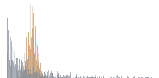
The image below is the decomposition of bar chart by elbow method. Regrettably, the overlapped part is identified as an extra cluster. The ideal number of clusters should be number of bars plus the background color, which is three.
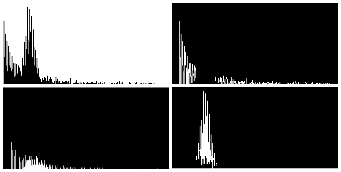
As the hyperparameters are always arbitrary, we have to rely on human intuition to calibrate the model. We plug in the magic number three and here we go. We keep the orange bars away from the grey bars.
Once different colors are separated, the rest of the operations become a lot easier. Images are represented in a numpy 2D matrix in opencv2. Decomposed images are filtered into black and white where the target is white and the rest is black. We can do a simple iteration to locate the row and column number of all the white elements in the matrix. Because the coordinates of these elements only reflect where they are in the image, a conversion from resolution scale to axis scale is necessary. For instance, the image has width and height of 100 but the actual X and Y axis ranges from -1 to 1. The coordinate of (10,20) should be converted into (0.2,0.4). Each number has to time the conversion factor (1-(-1))/100.
Last but not least, the data we obtain requires compression before usage. The compression works on both horizontal and vertical directions. From the vertical perspective, only the very top of the bar contains useful information. We merely fill anything below with the same color for the sake of aesthetics. Thus, only maximum Y value is kept given the same X value in the bar chart. In line chart, the median Y value is kept. From the horizontal perspective, the conversion from resolution scale to axis scale is insufficient. The size of the data must be shrunk from resolution scale to actual scale. For instance, the width of the image is 100. The actual data ranges from 1 to 10 with 10 data points. A straightforward way would be using double colon extended slices to take every tenth number. However, this approach largely ignores the nature of the cluster. The allocation of X values may lean heavily towards the highly dense area. I propose the alternative way, which is based upon the minimum absolute error. For instance, we need to take two values from [1.1,1.2,1.3,1.4,1.5,1.7,1.9,2.1]. Say the expected value is [1,2]. [::4] expression yields [1.1,1.5]. Minimum absolute error approach yields [1.1,1.9] because 1.1 and 1.9 has the smallest error against [1,2]. Although in this particular case of bar chart, the horizontal compression is rather difficult due to the lack of visibility on the mean degree distribution of random graph models. The horizontal compression makes more sense in the line chart as you would’ve seen later.
Now we reverse engineer the visualization of mean degree distribution. As no information is lost, I can confidently say the entropy doesn’t increase at all 👏
Let’s formally define the process of reverse engineering bar chart. The procedure is identical as the bar chart.
- Préparation
- Décomposition
- Triangulation
- Conversion
- Compression
When it comes to the second lab rat, additional steps are taken in the preprocessing. The erosion is required to connect dotted line into a solid line. It makes triangulation of the coordinates a lot easier.
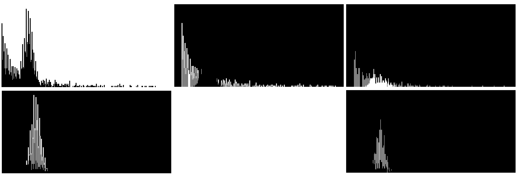
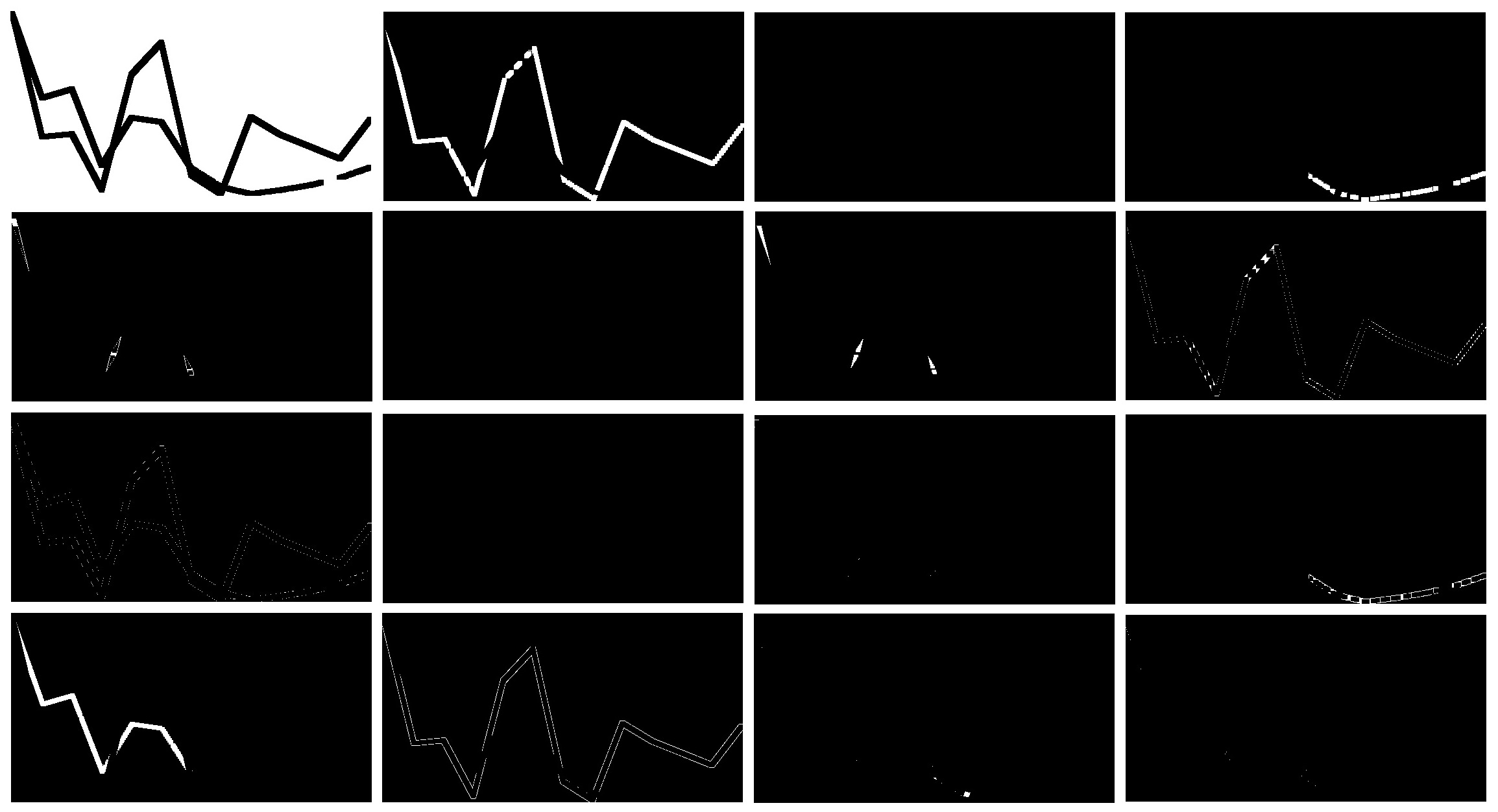
As usual, we would love to use elbow method to identify the optimal number of clusters. To our disappointment, elbow method never seems to work on the challenging part. As you can see in the notebook, only 3 clusters are identified and the connected dotted line gets the noise treatment. The objective of automation fails miserably. Hence, we manually input the magic number four, which is numbers of lines plus the background color. Abracadabra 😛
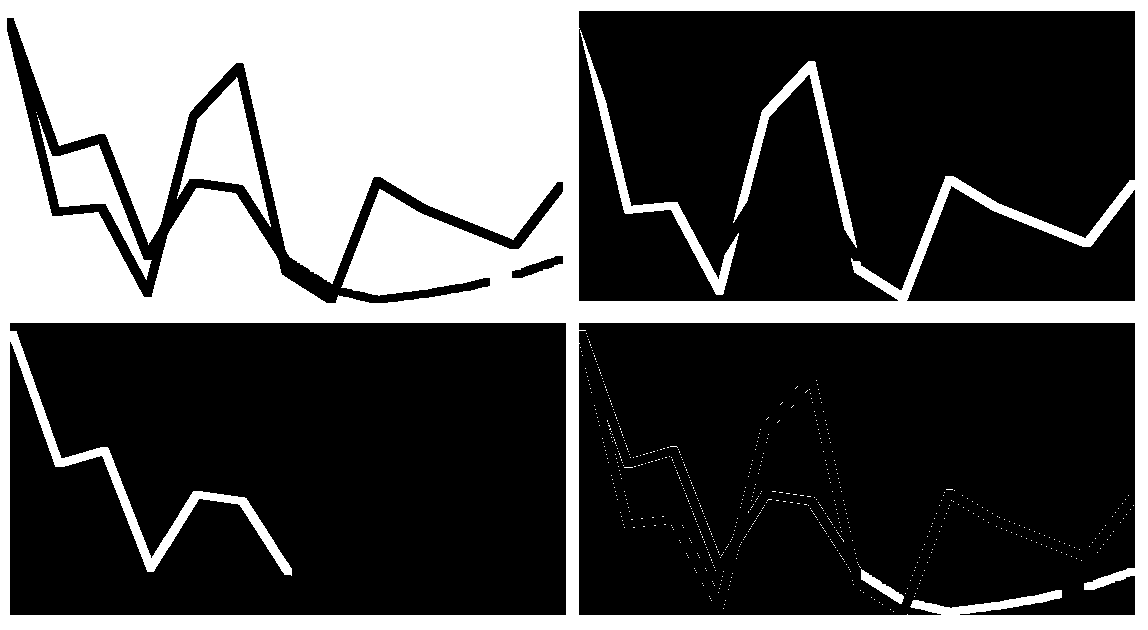
If you check the bottom right carefully, you’d notice the large amount of noise coinciding with the connected dotted line. They seem to be the edge color of red and green lines. Needless to say, erosion has to be performed to cleanse the decomposed image.
The rest of the operation is the same as the bar chart. In this case, the horizontal compression is performed on the line chart and increases the entropy. The reconstructed line chart demonstrates a tiny bit of difference in the slope, although almost unrecognizable by human eyes.
Distribution Model
Technically, K Means is a special case of expectation maximization algorithm. The computation of the new centroid is considered as E step. The label update of the underlying data points is considered as M step. In this chapter, we intend to examine the generalized case. One of the most common models powered by EM algorithm is Gaussian Mixture Model. Since GMM studies the mixture of different Gaussian distributions (whereas each distribution refers to a cluster), it is equipped with the magic to untangle the overlapped area where the result should point to multiple clusters. We have reasons to believe GMM may provide a better solution to the bar chart.
On the other hand, GMM doesn’t come without its caveat. Similar to K Means, GMM requires the hyper-parameter – number of clusters. Aside from that, the initial value of GMM is more complex. Instead of several random centroids, GMM requires mean, standard variation and weight of each distribution to kick start. The quickest convergence of GMM requires the initial result from K Means. In that case, GMM merely focuses on the intersection of different clusters to create clear cut boundaries.
To select optimal number of clusters, GMM can borrow Akaike Information Criterion and Bayesian Information Criterion from Gaussian distributions. Conventionally, lower AIC or BIC is always better. Nonetheless, I found that global minima of AIC or BIC rarely occurs in many real life applications. Empirically speaking, both AIC and BIC should be taken into account. By taking elbow method to locate the gradient dip, I prefer to take the minimum between AIC-indicated number of clusters and BIC-indicated number of clusters.
The image below is the decomposition of bar chart by GMM. Undesirably, six clusters have been identified. Many of the clusters are some colors human eyes cannot detect. As I frequently insist, machine learning is a state of art. Without domain knowledge, hyper-parameter tuning is like searching a drop in the ocean.
The malaise of any clustering algorithm is the optimal number of colors. Why not try an alternative model which the optimal number of clusters can be inferred from the data? Here we present you Dirichlet Process Gaussian Mixture Model (in sklearn, it’s called BayesianGaussianMixture). For those who merely want to use the reverse engineering tool to approximate the data, I strongly advise you to skip the next three paragraphs on DPGMM. Polya urn, stick breaking, Chinese restaurant process, Markov Chain Monte Carlo, variational inference, Gibbs sampling, if any of the above rings a bell, let’s go ahead.
When the weight of different Gaussian distributions is unknown, it creates two problems – we do not know the number of clusters and we don’t know the mixing portion of clusters inside the sample. Moreover, the weight of distributions is crucial to M step of EM algorithm where we compute the parameters μ and σ to derive posterior probability via Bayes’ theorem. Since the relationship between each data point and its cluster label follows multinomial distribution, it is wise to leverage a conjugate prior distribution (which is Dirichlet distribution) to bypass the involvement of mixing portion. Dirichlet distribution is de facto a distribution over distributions. By definition, the mixing portion can be thought as a variable drawn from Dirichlet distribution.
Once you understand the rationale of Dirichlet distribution, we have to introduce Dirichlet process. Dirichlet process can be seen as the infinite-dimensional generalization of Dirichlet distribution. The most common examples for comprehension are polya urn, Chinese restaurant process and stick breaking. In laymen’s term, Dirichlet process creates snowball effect.
Each time we draw a variable from the distribution, this variable either follows an existing cluster or creates a new cluster. In Dirichlet process, the probability of each data point’s cluster label is proportional to the number of existing data points under the cluster label. Theoretically, the number of clusters can go into infinite. The reality is, once a cluster accumulates a large quantity of data points, more and more data points would follow the majority. In the end, there will be only a handful of useful clusters.
In GMM, we initialize the mixing portion. To avoid the mixing portion in DPGMM, we must find a way to plug Dirichlet process into prior probability. As Dirichlet is non-parametric, the computation of integral would be almost impossible. There are two different ways to tackle the problem in the mainstream.
- Markov Chain Monte Carlo is the conventional way. Recall from Dirichlet process, the probability of each cluster label for each drawn variable is only determined by the size of each cluster at the current state. The size of each cluster at the current state is only correlated to the previous state (which label size gets incremented from the previous variable). That effectively forms a Markov Chain. After we arbitrarily create the initial state, we draw the cluster label of each data point from Dirichlet process via Gibbs sampling. The method makes use of the most recent state and updating the status with its new value as soon as it has been sampled.
- Variational inference is currently adopted by many packages including sklearn. Variational inference minimizes KL divergence between Dirichlet (prior) and multinomial (posterior) via convex relaxation. The approximation of the lower bound for the marginal likelihood is executed through coordinate descent. Due to its optimization nature, variational inference is faster and exhibits less variance in its convergence time.
To fully understand DPGMM, knowledge in measure theory is a prerequisite. Most papers omit a lot of steps in the derivations and they create more confusions rather than explanations. One of the materials I prefer is a DPGMM tutorial for psychology students hosted on National Institutes of Health.
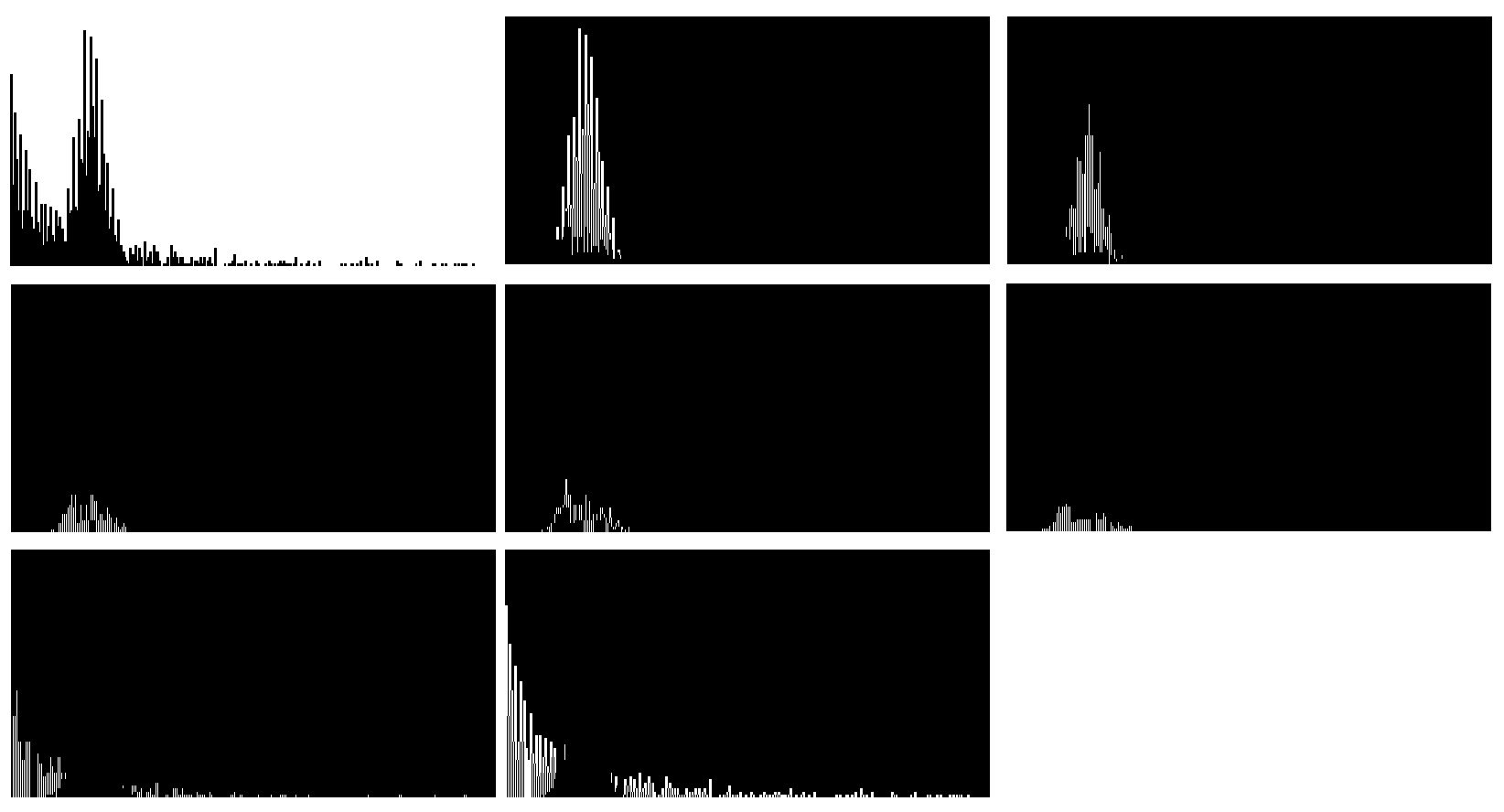
Enough about fancy talks on math, let’s shed some light on the performance of DPGMM in reverse engineering. As shown in the image below, nine clusters have been identified. In sklearn, an initial guess of number of clusters is required. Although the algorithm may help you re-identify some of the clusters, different initial values can actually lead to different end results. In our case, the model complexity doesn’t translate to the cluster accuracy. The disappointing result does not justify tens of hours of my life spent learning Dirichlet process 😩
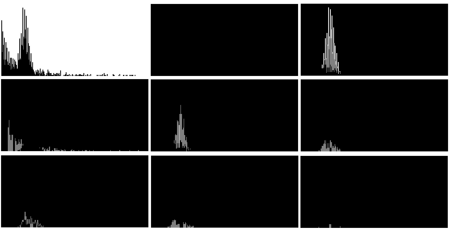
Surprisingly, GMM works very well on line chart. GMM successfully distinguish four clusters including the dotted line. Albeit K Mean only identifies three clusters. The clusters from GMM are slightly different from K Means. Some green colors at the peak of crude pail oil are in the same cluster as the crimson dotted line. As bizarre as it sounds, the reverse engineering works quite well after dotted line erosion. A similar dual axis plot is able to be reconstructed.
With respect to DPGMM, 17 clusters are identified despite we initialize with 20 clusters. Most of the clusters are scattered points in the outskirt of the image. Again, the sophisticated model lets us down. Dirichlet Process doesn’t materialize the great prospects we expect.
Density Model
After trying centroid and distribution model, the last but not least is density-based models such as DBSCAN or OPTICS. Unlike K Means or GMM, DBSCAN provides non-linear boundary clustering. This type of model was born to detect arbitrarily shaped clusters.
The way to detect clusters solemnly relies on distance measure. The distance measure ε defines the maximum distance between two data points within the same cluster. To identify a cluster is the same as constructing a topological structure like geometric graph. This also implies the model is robust even trained with noisy dataset. However, the optimal distance measure ε is too challenging to configure without domain knowledge. Another faux pas is within-cluster variance. When the distance distribution within the cluster gets fat tail, density model is unlikely to work well.
In our case, the data point is scattered sparsely on RGB 3-dimensional space. Inevitably, the density of each cluster should be high due to the fact that Euclidean distances within the same color group are small. The distance between two cluster is supposed to be significant which attributes to the fact that distinct curve colors in chart convey messages in a more straight-forward way. Although the boundary is anticipated to be linear, DBSCAN shouldn’t do too bad even with mediocre choice of distance measure.
As a matter of fact, we didn’t manage to use DBSCAN with a feasible distance measure. By using knee method, KNN distance concludes zero is the optimal choice. Apparently, more advanced technique to select ε is a must. That’s why we have OPTICS.
OPTICS utilizes a special ordering based upon the organic order and the reachability distance to skip the needle search of optimal ε in the haystack. As a result of quid pro quoi, ξ is a new parameter to determine the steep upward and downward areas in reachability plot. The valleys between steep upward and downward areas would be identified as clusters. The optimal ξ is an elephant in the room of machine learning. Nobody talks about how to pick the best criterion for reachability. To make our life easier, let’s just take the default value 0.05 from sklearn.
In the bar chart, OPTICS give us eight clusters, pretty much on par with DPGMM. Again and again, the model complexity doesn’t translate to the cluster accuracy! Let’s not use sledgehammer to crack a nut.
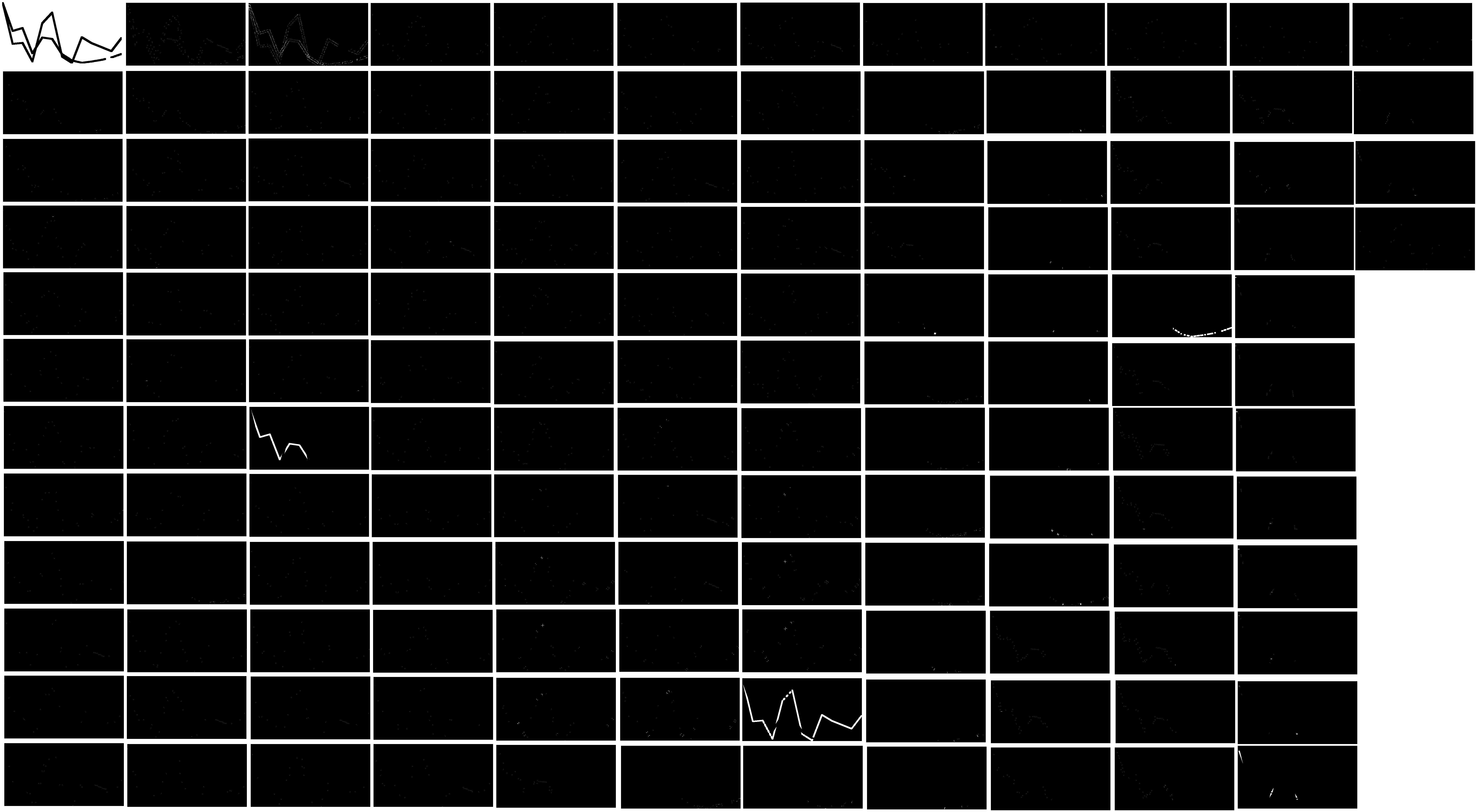
If the result of bar chart is reasonably complicated, the result of line chart is then outrageous. It takes approximately 15-20 minutes to run OPTICS on line chart. We end up with 137 clusters??? To be fair, basically every unique RGB value forms a cluster. The subtitle of density model should be replaced by “how to build Rube Goldberg machine”!
Discussion
In summary, we have proposed three different types of unsupervised learning models to reverse engineer charts. The pain point of the process is to automatically separate different color channels. Well, panacea doesn’t exist. No single model has proven its stable performance in both line and bar charts. Regardless of all the scenic routes we have taken in unsupervised learning, K Means is absolutely the best choice considering its simplicity and accuracy. With a little bit of manual cropping and cluster count, our tool can seamlessly approximate the original data and replicate the underlying chart. They said data is the new (snake) oil. Imagine how many barrels this project “Aramco” could’ve extracted!
Click the icon below to be redirected to GitHub Repository