Smart Farmers
Table of Contents
Intro
🍊 🍍 🍈 🌽 and 🍠 are something we have been taking for granted. Up until COVID-19, we finally come to senses that farmers are one of the low-paid essential workers. This project is dedicated to the optimal allocation of agricultural resources. By trading agricultural market, we are able to eliminate the inefficiency in the crop market. Ideally no food will be wasted and farmers will be fairly compensated.
The project per se intends to leverage convex optimization to approximate farmers’ plantation planning for different crops. Assuming farmers are Homo Economicus, their end game is to maximize the profit regarding the price impact from supply and demand. Their decision is constrained by arable land area and biological features of crops. We develop this smart model accordingly to acquire a head start in trading 🍚 ☕ and 🍫
Assumption
The core of this project is Efficient Market Hypothesis. As faulty as it sounds, there is only one way to be rational (call it Pareto Optimal as you may) but one thousand ways to be irrational. Efficient Market Hypothesis allows us to convert head-scratching individual decisions into the simplest form of supply and demand. We aggregate all farmers inside one country into a big farmer union to study their collective behavior. The farmers in the union are presumed to be Homo Economicus. They have one simple but elegant objective, to maximize their margin.
To make the ultimate result more robust, we slightly expand the assumptions.
- No extreme weather prior to farm planning. No flood/drought, volcano eruption, locust invasion, El Niño or La Niña is expected. Agricultural market is predominantly supply-driven. Weather is the biggest factor that leads to supply shock and price spike. Even if future climate condition may impact the choice of crops, as we have witnessed how global warming encourages farmers to grow grains in Siberia, we can easily modify the list of crops we are monitoring with the assistance of agronomists. In reality, big farms normally implement protection measures in advance, e.g. better irrigation system to fight against drought. This can be easily embedded into the cost of planting certain type of crops.
- No sudden surge and plunge of domestic demand. This assumption eradicates the demand side in the model so we can derive an analytical solution from the supply side. The domestic demand for each type of crops is determined by the population and the disposable income. Beyond Meat and Impossible Whopper are absolutely overhyped. The rise of veganism will merely increase the plantation of soybeans in the long run. Moreover, crops are primarily for culinary consumption. Some crops such as corn and sugar cane are the raw material to generate ethanol for biofuel. Other crops such as acorn and oat are essential feed for livestock (cereals for your favorite prosciutto di Parma). They are relatively niche compared to culinary consumption. Nonetheless, we can always use multiple layers to prove that both industrial and livestock demands are fundamentally driven by the population and the disposable income.
- No major upgrades of agricultural technology. AgriTech covers a lot of topics including satellite image monitoring, drone pesticide spreading, robotic fruit picking, crop gene engineering, etc. To be honest, IoT sensors, AI management or automated machinery do not really matter to the model. This assumption just focuses on the expected yield of crops. Any technology progress that improves the adaptability of seeds and the fertility of soil should be our concerns. In the next chapter, the scarcity of arable land will be one of the constraints that make farmers rational. Advancements like vertical farming can easily distort the model since the expected yield of crops fully depend on the number of storeys.
- No arbitrage between domestic and international market. Oui, oui, we all know international trade is a big deal. Here, we are creating a utopian closed-system where self-sufficiency is achieved. Later in the discussion, we will expand the naïve model to a more general form to somewhat relax the assumption. Apparently, the pain point is data availability. To map out the arbitrage, the freight cost and the tariff should be taken into consideration. Given the complexity of tax systems and the variety of trade routes, this assumption makes our life easier.
- No logistic bottleneck and liquidity issue. First of all, all crops are shipped to the nearest buyers to preserve the freshness so the low cost of the cargo can be ignored. Second, probably one of the most controversial assumptions, all crops will be absorbed by the market. Those who cannot be consumed locally will be shipped to the nearest available market. Those who cannot be consumed domestically will be shipped to the international market. According to my business intelligence, the undersupply caused by weather disruption is the common phenomenon. However, most of the farmers disced excess crops back into the ground during COVID-19. The commies will be like, ‘this is the inherent evilness of capitalism, why not donate surplus load to the food bank before rotting?’ The raison d’être is always the cost, the cost of harvest and transportation.
- No premium and penalty for heterogenous crop quality. We are assuming all crops within the defined category is identical and sells at the same market price. There is no Michelin-restaurant grade Basmati rice, Charlotte potato or blood orange. This is another assumption caused by data availability. Agricultural products have far more sophisticated grades than other commodities. Different origins usually refer to different percentages of nutrients (like Brent or WTI). Different varieties lead to different tastes (blueberry/blackberry/raspberry). Then you have labels of organic, conventional or gene-modified. Even brand premiums! See that Zespri on your sungold kiwis? Homogeneity greatly reduces the workload of price collection.
Theoretical Framework
Objective Function
Maximize total profit regarding supply and demand for each type of crop
Constraints
- Government intervention
- Annual crop rotation
- Perennial crop lifespan
- Limited arable land
Workflow
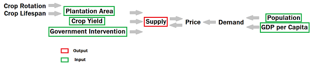
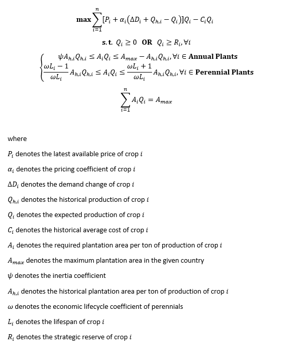
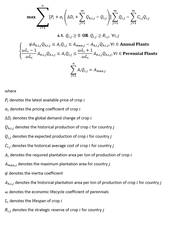
As we have mentioned in the assumptions, the objective of the farmers is straight forward, profit maximization. The profit equals to unit revenue minus unit cost then times the quantity. Inevitably farmers would love to increase as much output as possible since they gain no control over the unit cost. There is only one small faux pas, too much supply can damage the crop price which ultimately leads to the decrease of the total revenue. Hence, farmers have to strike a delicate balance to plant each type of crop. When facing oversupply of one type of crop, farmers need to decide whether the greater market share can compensate the loss from the crop price, or it is wise to switch to another type of crop. Translated to mathematics, the entire decision on choice of crops becomes the pricing mechanism of each type of crop. We will expand on the topic of pricing later. For the moment, let’s just quickly scan over the main equation. The objective function can be broken down into four parts. The first one is the declaration of maximization. Next, Σ denotes a sum over each type of crop. The first term after Σ is price (everything inside the parenthesis) times production of crop i. The second term after Σ is cost times production of crop i.
For the cost, it is tricky. If you read FAO handbook, you will be astonished by the overloaded dimension of the cost data, how are you supposed to collect so much data? According to US farm production expenditure summary, the biggest cost is labor (what happened to illegal immigrants?), land, fertilizer and seed. Rents, tractors, trucks, repairs and other fixed costs are always there in spite of the crop choice. The same applies to the labor. Unless the farmers decide to switch crops, they should have plenty of seeds produced by the existing crops. The good news is we are only left with fertilizers and pesticides. There are plenty of free data on the website of IFA. It’s still a pain in the ass given that each type of crop requires a unique intensity of NPK compound fertilizers. After weeks of brainstorming with my friend, it suddenly came to my mind that cost doesn’t have much impact mathematically when we study the aggregated farmer behavior (for individual farmer it’s a huge one). Later, you will see that both inequality and equality constraints are the major factors. At this point, the cost can be simply calculated via production-weighted profit.
Nevertheless, the game isn’t this simple. We cannot ignore the intervention of government policies. Farmers may be entitled to subsidies if they grow specific types of crops. We all know at least one-third of EU budget goes to every EU farmer who meets the requirement of environment, sustainability and biodiversity (375 € per hectare, younger gets more). Some of the governments in the world maintain food stockpiles in case of a famine. To suffice the government requirement, there must be mandatory minimum production of grains to avoid the food crisis. After all, Hannibal the Cannibal is a real nightmare. These non-market behaviors can influence farmers’ choice of crops. Therefore, this creates our first inequality constraint, the government intervention. It can take the form of either non-negative production or minimum required production of crop i.
Moreover, Farmers need to consider the biological features of the crops. Crops are categorized as annual, biennial and perennial plants. Annual plants grow and die within a year. They are the prime target for crop rotation to improve soil structure and organic matter. Biennial plants grow and die within two years. To make our life easier, we consider biennial plants as annual plants which is a common practice in farms. Perennial plants take years to grow and mature and their lifespan can be longer than Homo Sapiens. Farmers are unlikely to replace perennial plants which can still bear fruits for the next few years. They have fewer incentives to grow perennial plants which take years to bear fruits. What if this year’s price rally of 🍎 turns to a price freefall next year?
Thus, the second inequality constraint is born. For both annual and perennial plants, they are bounded by upper and lower thresholds. The lower threshold of annual plants is determined by the inertia. Even though the farmers have free wills to choose commercially viable crops, their decision will be limited by their knowledge domain and soil suitability. Different crops require different level of soil acidity and other measures. Needless to say, the knowledge takes time to learn. Furthermore, the drainage condition may affect the choice of crops. That’s why we introduce the inertia coefficient ψ, which controls how much hectare of crop i will remain intact. The inertia coefficient ψ is set at 0.8 by default. As observed throughout the dataset, farmers hardly ever experiment new crops above 20% of their plantation area in a single year.
The upper threshold of annual plants is determined by the crop rotation. Monoculture ends up with the same pest and weed community each year. Crop rotation creates a diverse environment and utilizes the ecosystem service to build up the resilience of the farm. With crop rotation, the theoretical largest plantation area of crop i next year equals to this year’s maximum arable land minus this year’s plantation area of crop i. In another word, the theoretical maximum plantation area of crop i equals to sum of this year’s plantation area of any crops apart from crop i.
The lower threshold of perennial plants is its long economic lifespan. The biggest issue is that nobody knows the exact age distribution of crop i aside from the actual owner of the farm. At this time, we assume a uniform distribution. Each year only a fraction of crop i reaches the end of their economic lifespan and the rest keeps nourishing. The farmers merely need to decide on the choice of that fraction, replace the old with the new or cut off and try others. To be more precise, that fraction equals to one over ωL where ω denotes the economic lifecycle coefficient (I consulted my agronomist friend and she suggested 0.7) and L denotes the average lifespan of crop i.
The upper threshold of perennial plants is its long growth period. Some trees take years to bear fruits. Even if we plan to increase the plantation of perennial plants ridiculously, we will only be capable of harvesting so many fruits next year. To be more precise, we can only harvest (ωL+1)/ωL at maximum. Assuming no perennial plants exceed their economic lifespan this year, the plantation increment of crop i should be the same as the fraction that we would’ve chopped off (the fraction in the lower threshold), since the age of crop i is uniformly distributed.
Last but not least, there is limited supply of arable land inside the system. For the sake of ESG, deforestation requires approval from the local government (didn’t stop the notorious palm oil apartheid between EU and Malaysia). Farmers do not have the luxury to grow infinite number of plants. Additionally, each type of crop requires different amount of plantation area. Social distancing is a must for planting trees to prevent competition for sunlight and water. On the contrary, the field of roots and tubers can have higher density. We will take the historic average of the inverse of the yield to get the required hectare per each expected tonne of crop i. This computation allows us to take discount from weather risk, which indicates no bias towards a good year or a bad year.
Hence, we derive the equality constraint, the total available land area for plantation. It is rather difficult to predict how much land area will increase by the issued permits or decrease by the natural disasters. We can only do two things to get around the trouble, take the last available number or create scenarios with inputs from agricultural experts. However, the big malaise of the equality constraint is the life cycle of some annual plants. Some of the crops grow and mature within several months even several weeks. Yet, the time horizon of the whole model is on an annual basis due to the classification of annual and perennial plants, which implies harvest area of some plants is repeatedly taken into account. The sum of cropland is inevitably larger than the maximum arable land. It is something worth exploring. With no solutions in sight, we have to turn a blind eye for now.
After we set things straight at the objective function and the constraints, we can move onto the core part of the model, the pricing mechanism. Let’s borrow the concept of market equilibrium from microeconomics. Alfred Marshall introduced the idea of supply demand model into economics. Where supply curve with negative slope and demand curve with positive slope intercepts denotes the equilibrium price.
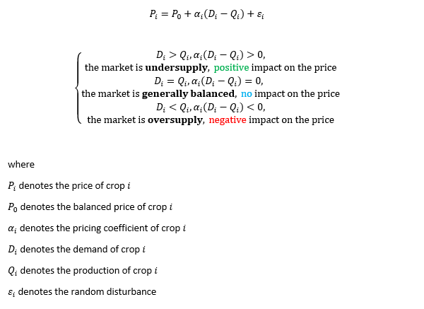
By using linear approximation, we obtain the equation above. Price of crop i equals to the equilibrium price plus the mismatch between supply and demand. When supply exceeds demand, the market condition is oversupply. The difference between demand and supply is undisputedly negative. After multiplied by pricing coefficient α, the difference converts from several hundred tonnes to the scale of US dollar per tonne. The equation easily generates a downward pressure on the equilibrium price, and vice versa. With some random disturbance ε (force majeure), the linear regression emerges.
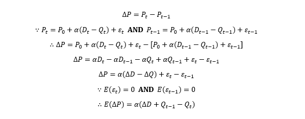
Now that we obtain the pricing mechanism, we shove it back into the original objective function. Because the income per crop is estimated via last available price, the expected unit revenue equals to the latest price plus the change of the price caused by supply fluctuation through the pricing mechanism. The price change can be easily derived via the first order difference of price at time t and t-1. We already know the number of this year’s supply but want to get the answer of next year’s, so we use next year’s supply minus this year’s supply instead of the abbreviation of ∆Q. What is ∆D though?
Let’s solve the final piece of the puzzle. Prior to our assumptions of demand, demand is driven by the population and the disposable income. Disposable income is slightly complicated to compute but we can easily find its substitute, GDP per capita. Intuitively we can create a regression model like the pricing mechanism. The only problem is we cannot directly observe the value of demand which bridges the gap between two regression models.
Fortunately, there is an econometric tool called instrumental variable. By using 2-Stage Least Square, it creates the possibility of making causal inferences with observational data. A valid instrumental variable has a causal effect on unobserved variable but no confounding for the direct effect on the dependent variable. Both population and GDP per capita make brilliant instrumental variables. In layman’s terms, population and GDP per capita have no direct power over the crop price. They can only influence the crop price indirectly through the change of demand. Voila, the only unknown variable inside the framework is expected production of each type of crop.
In order to get the optimal production of each type of crop, we steal something called quadratic programming from the toolbox of convex optimization. We have to transform the equations above into the matrix form below. While using CVXOPT, a couple of things are moderately modified. First, we will minimize the negative version of the objective function rather than maximize the objective function. Then, the inequality constraint must follow the form of not-larger-than. Many smaller-than inequalities are converted to the negative version of not-larger-than. At last, we ought to construct block matrix to satisfy the requirement of a single inequality constraint.
Splendid, all 🙌 on deck, it’s about time to move towards the next chapter!
Data Specification
As you can see in the methodology, this model consumes an insane amount of data and workload. The silver lining is, we can find most of the data with consistent format from one source, Food and Agriculture Organization. FAO is an organization under United Nations and it provides a database with absurd level of details. The metadata consists of production, yield, land area, price, GDP per capita, population and so much more that we don’t need. The database is about 14 gigabytes after decompression. The csv of international trade alone takes up 4 gigabytes 😲 Unfortunately, I cannot upload the full data to GitHub so you will have to download it from the source.
The time horizon of the model is set from 2013 to 2018. The FAO data of 2019 hasn’t been released at the beginning of this project (June 2020). You can trace the record further back to 1975 if needed. The target country is handpicked as Malaysia because I am a big fan of Nasi Lemak. Lol no, I am not. The actual justification is its low variety of crops. For Malaysia, we only need to examine 61 categories of crops but for Italy the number becomes 111 😅 After removing crops which takes less than 1% of the land use, we end up with 30 categories.
Even inside 30 categories of crops, the issue of missing price data persists. There are a couple of ways to fill the missing data, use the previous value, the latter value, arithmetic average or Kalman Filter. Here, we propose an unconventional way, synthetic control method. Synthetic control method is widely used in political science to evaluate the effect of a policy. It was populated by the study of how terrorism casts shadow over the economic growth of Basque (Abadie and Gardeazabal 2003). The idea of synthetic control unit is to assign weights to control groups to create a synthetic group equivalent to the treatment group before the policy. In our case, control groups are countries with price data of certain crops. The treatment group is Malaysia without price data of certain crops. The policy is simply missing price data. The raison d’être is clearly the market efficiency. In fact, the agricultural market isn’t as domestic as in the model. The price deviation of the same crops between two countries creates an opportunity of arbitrage. In one way or another, the price disparity of two countries will eventually converge to zero. Of course, some nasty governments use tariff, quota or other “ESG” reasons to stop it at the living cost of ordinary people. Luckily, it’s not the case of Malaysia. Thus, we can obtain the missing price data by synthetic control method. Now all the price data can be standardized into annual average producer price in US dollar.
Regardless of the numerous dimensions of FAO, FAO still lacks in one type of data, the lifespan of each crop. This is the biggest hurdle of data collection. As mentioned in the theoretical framework, we create the preference towards annual plants to create more flexibility for farmers to switch crops. Yet, figuring out the lifespan of perennial plants is not a walk in the park. If you search the lifespan of an apple tree, you will end up with multiple answers from 60 to 150 years. Let’s define a tidy structure for this challenge. We only collect the information of the first page of google organic results and take the mean of different numbers. After that, we create mapping.csv and upload to GitHub. You are welcome to raise an issue when you disagree with any number inside this file.
Empirical Result
How does the model perform against the reality? Let’s run a backtest. Unlike traditional regression, the convex optimization doesn’t allow us to do in-sample and out-of-sample analysis. The backtest is purely based upon one step ahead forecast for each year. For each crop, we examine both price and production to determine the accuracy. In general, the model is a useful tool on around 65% of the crops which we should be really grateful. In quantitative trading, we can churn out a Gulfstream G6 from a factor with odds at 55%. Obviously, we cannot present the backtest result of 30 types of agricultural products. We will only select 25% of the outcome to conduct analytics. Each crop listed below demonstrates a unique challenge.
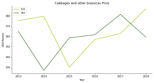
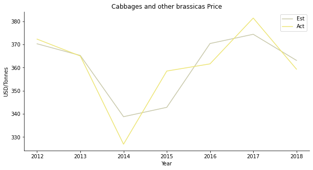
The first target is cabbage. Honestly, I don’t recall eating cabbage in a Malay restaurant, probably in a Peranakan restaurant? The estimated price of cabbage looks like an AR1 model. The lime line seems to be a replication of the green line with one-year lag. I wouldn’t be surprised given that the estimated price equals to the last available price plus the pricing mechanism.
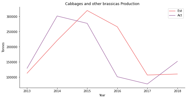
The same can be said to the production backtesting. The red line always lags the violet line by one year.
In the actual regression stage, the in-sample data is a nice fit. The purple line captures the overall trend but has a smaller volatility than the yellow line. There is a valid causal relationship between price and supply plus demand. Cabbage is apparently for domestic consumption. Seriously, besides Singapore, why would anyone import cabbage from Malaysia?
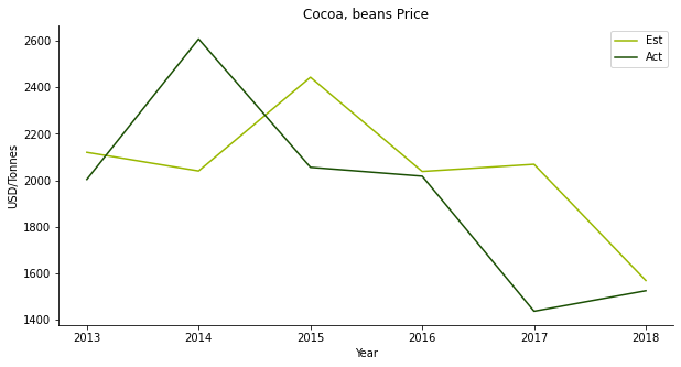
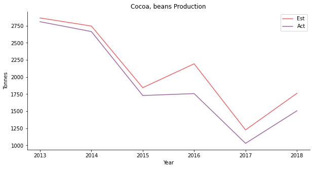
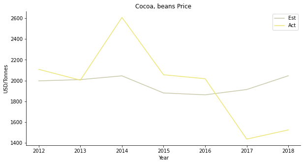
The second one is cocoa. Who doesn’t like chocolates? Although Malaysian cocoa beans isn’t known for its top-notch quality, the cocoa tree occupies quite a large area of plantation area. I suspect it has something to do with the popular drink, Milo Dinosaur. The price forecast shows similar traits as the cabbage, AR1 model.
Yet, the production backtest is a different case. It’s a flawless forecast on the production side. Since our model is centered around the expected production, it kind of makes sense.
The regression result sounds worrisome. The demand of cocoa beans does not appear to count on GDP per capita or population. I suppose, you buy iced Milo when you are broke and you buy one more spoon on top when you are rich?
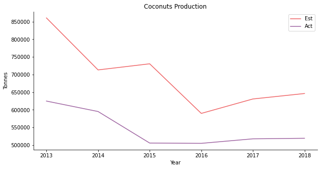
The third one is coconut. Nobody loves coconut rice like Malays. Nothing tastes as delicious as coconut rice with pandan leaves. The estimated coconut price looks the part. The prediction successfully simulates the V-shaped recovery of coconut price.
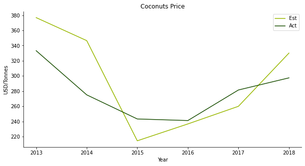
But the production is severely overestimated. At first, the downhill production of coconut coincides with the collapse of the price. The production hasn’t kept up with the price rebound ever since.
For the regression, supply and demand do not have the explanatory power over the coconut price at the beginning. Gradually, the relationship starts to reveal itself. As Malaysia exports coconut oil for cosmetics products, the domestic demand isn’t sufficient for the model.
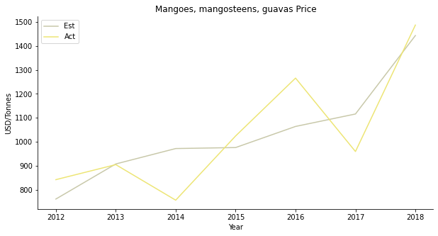
The fourth one is another tropical fruit, mango. You can put it in chicken curry or chendol, either way, so yummy. The price forecast is a disaster. The actual price moves completely opposite to the projection.
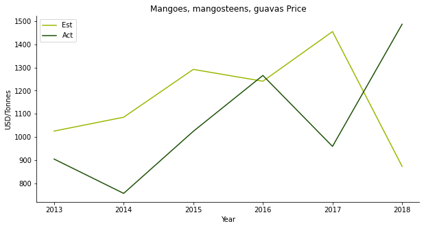
The estimated production follows the trend but with a larger magnitude of fluctuation. Especially in 2015, the model expects a price peak for some unknown reason.
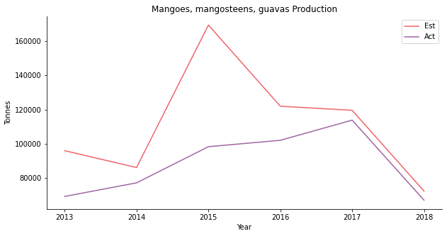
Supply and demand do not work in mango’s case, either. People usually buy imported mango from Thailand. Domestic demand should be able to cover the model. It’s a bit strange that some other hidden factors influence mango demand.
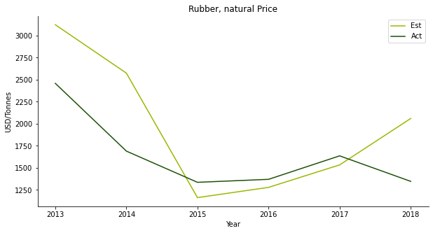
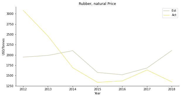
The fifth one is rubber. Rubber is a public traded commodity in SGX with RSS3 and TSR20. It used to play a giant role in Malaysia’s export business before the bonanza of oil palm. Many rubber end products are big industries in Malaysia, such as tyre and condom. The plunge of the rubber price prompts the farmers to switch crops. However, the price prediction works spectacularly well.
Despite the overestimation of rubber production, the model provides a clear picture of the underlying trend.
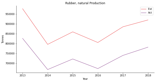
Supply and demand do not work on rubber as well. Since rubber is an export business, the model must take in consideration of international demand.
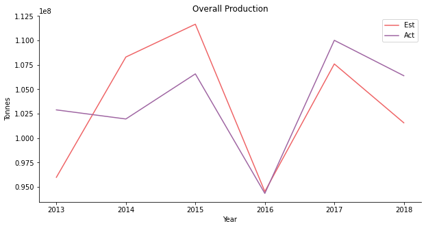
At the first glance, the model works well on the overall production of all 30 crops. If you break down the actual volume of each crop, you will realize oil palm is actually the predominant driver. The total production is merely a reflection of oil palm. Oil palm fruit is the raw material for palm oil. Malaysia is the second largest palm oil producer trailing after Indonesia. The oil palm industry is a pillar of the Malaysian economy.
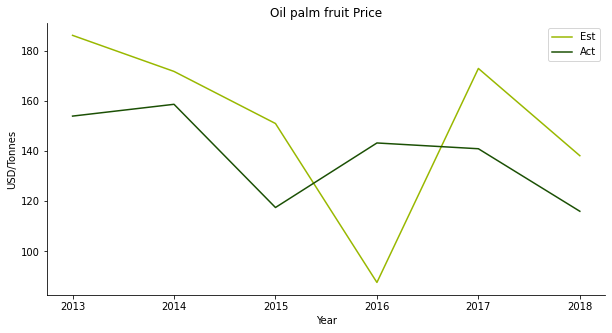
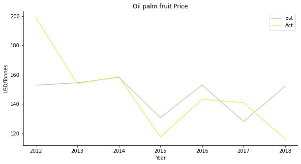
The prediction of oil palm looks a bit weird. In some parts, it shows some features of AR1 model. In other parts, the model appears to be accurate. Oil palm is perhaps the most commercialized commodity among 30 crops in the model. It is rather difficult if not impossible to speculate the price movement of oil palm.
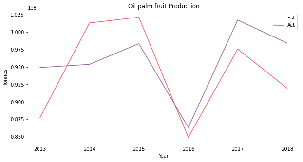
Though the price projection is gibberish, the model yields a convincing outcome on the production. Oil palm possibly has the smallest mean error compared to other crops.
Supply and demand explain the price in the earlier period. Throughout the recent years, the relationship begins to cool down. Palm oil is a lucrative export business in Malaysia. The external business environment should have a bigger influence than local population or GDP per capita.
Discussion
I’ve never seen a bad backtest.
--- Dimitris Melas, Head of Research at MSCI
To be fair, the excellent result of backtesting occurs because we are using God's eye view. Since we are in 2020, we already know the historical population and GDP per capita of Malaysia. When it comes to trading, the forward-looking capability is what we care the most. To make a price or production forecast, there are many variables to be plugged in. In order to obtain price and production, the framework requires a projection of demand (population and GDP per capita), agricultural land and crop yield. Attributable to the variety of the input, this model is more like a scenario analysis tool. We can adjust each input variable to see how the price and the production of each crop are responding accordingly.
A comparison with futures market is the best way to test the forward-looking accuracy of the model. Bear in mind that not all crops are commoditized in the financial market. Here we select palm oil, for its immense liquidity, to make a forward testing. In Malaysia, there are two types of price associated with palm oil, Fresh Fruit Bunches (FFB) and Crude Palm Oil (CPO). The model per se gives out the raw material price which is oil palm fruit FFB price in US dollar per tonne. The historical benchmark we are using for comparison is Bursa Malaysia Ringgit denominated CPO futures generic first contract. The benchmark requires some computations of annual average and US dollar conversion before plotting. The contract size of the futures is 25 metric tonnes. As a consequence of unit mismatch and other fees involved in the oil extraction, we would visualize both prices in separate axis.
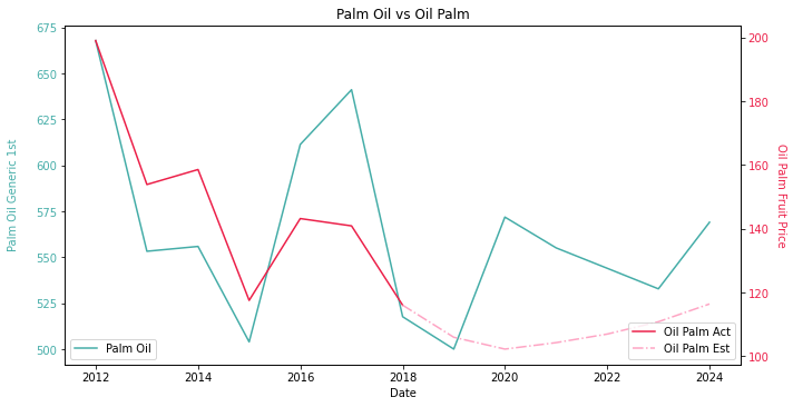
Oil palm FFB price forecast is based upon a few assumptions. The demand consists of UN population forecast and IMF GDP per capita forecast before COVID-19. We assume a 5% Year-on-Year increase in agricultural land. As for the crop yield, we are taking the historic average to eliminate the influence of weather. Palm oil CPO futures price is collected from Bloomberg on the 8th of July. As you can see, the forward testing isn’t as fantastic as the back testing. The model suggests a backwardation from 2018 to 2020 and a contango from 2021 onwards. Apparently, the actual forward curve is more like a W-shaped recovery thanks to fucking coronavirus. If we create a short position in 2018 and keep rolling over the contracts, not sure how many investors have pulled out their money from our hedge fund in 2020 😑
Why is there a huge price divergence? Well, first of all, we are using an outdated population and GDP per capita forecast. The damn virus in 2020 has slashed GDP per capita growth for every country in the world (thank you for concealing information). The virus has severely disrupted the population growth as well. I mean, does anyone want to get pregnant during pandemic? Second, the area of agricultural land is another issue. The arable land is impractical to forecast. The last but not least, the crop yield is stagnant in our model. Now we have a hike of the demand. Yet, the supply cannot keep up due to the stagnant growth from total plantation area and crop yield. An increasingly undersupply market will certainly push the crop price through the roof. The solution is simple. We can send our enquiries to the economist friends and grab the latest population and GDP per capita forecast with COVID-19 taken into consideration. As for the crop yield, we should go to our agronomist friends to get a sense of the future fertilizer usage and climate change. Alternatively, if we have no economist or agronomist friend, we will just create scenarios, e.g. 2%/5%/7% increase in crop yield.
One thing about forward testing we didn’t mention is the export nature of palm oil. The convex optimization model is no panacea. It works fine with peppers or lettuce given their scale of domestic consumption. To estimate the demand of palm oil, perhaps its biggest buyer India should be counted in. Truth be told, the customers of Malay palm oil are so fragmented. Top 20 does not even cover more than 75% of the market share (calculation based upon Global Trade Atlas data). Thus, we propose a more generalized model. For a closed-system that craves for self-sufficiency, e.g. EU, the naïve form works alright. When it comes to powerful agricultural exporters such as US or Canada, we will need a Ricardian model.
David Ricardo created this model by demonstrating an international trade of wine and clothes between England and Portugal. In our case, Ricardian model is a Ricardian international trading system where different countries produce each crop proportionally to its cost and plantation area which are considered as comparative advantage. To preserve the robustness of the model, the assumptions of the naïve form stay the same. We only need to fortify two of the original assumptions.
- Data availability assumption
Although FAO provides a detailed list of crop price in each country, Ricardian model only uses single price for one type of crop regardless of the origin, ideally from CME or ICE futures. The arbitrage cost is the major cause. The logistic and warehouse cost could take enormous amount of time to find. The same applies to the tariff or the quota which are buried inside government documents and updated frequently due to trade frictions. In this sense, Ricardian model removes all trade barrier. The market share of each crop for each country is determined by the cost and the plantation area. Ricardian model also removes the heterogeneity in the agriculture technology and natural condition. The universal crop yield is applied to each country.
- Homo Economicus assumption
The naïve form is centered around the idea of Pareto Optimal. The generalized form also ensures Pareto Optimal equals to Nash Equilibrium. In another phrase, the illicit market behaviors such as competition and collusion do not take place among different countries. We have heard of the infamous oil price war between Russia and Saudi Arabia. Their competition of the market share led to the plummeting oil price. Their collusion also led to the bankruptcy of many shale oil producers in Permian basin. In this zero-sum game, the slice may be larger for some players but the cake is definitely smaller. In our Ricardian model, the end game is to maximize the total profit sum of all countries. It’s a bigger cake for everyone although the slice for individual player is not guaranteed to be bigger.
The generalized form looks like the cousin of the naïve form. There are only minor changes in the mathematics form. We have one more sum function Σ to capture each country with subscript j in the system. The list of countries should include importers and exporters for each type of crop to cover ideally 90% of the market activity. Well, given the data complexity of Ricardian model, it is likely to take a decade for me to collect everything and simulate the model. Since we have talked about the smart farmers, let’s be smart researchers for once. Amid the decent performance of the naïve form, why bother fixing it when it’s not broken? The bottom line is, as long as we collect good forecast of population, GDP per capita, arable land & crop yield, we are able to make one year ahead forecast for both crop production and price. In that way, we can adjust our futures contracts accordingly and switch from the front month to a further-out month.
Further Reading
- Abadie A, Gardeazabal J (2003) The Economic Costs of Conflict: A Case Study of the Basque Country
- Angrist JD, Krueger AB (2001) Instrumental Variables and the Search for Identification: From Supply and Demand to Natural Experiments
- Komareka AM et al. (2017) Agricultural Household Effects of Fertilizer Price Changes for Smallholder Farmers in Central Malawi
- Louhichi K et al. (2010) FSSIM, A Bio-economic Farm Model for Simulating the Response of EU Farming Systems to Agricultural and Environmental Policies
- Louhichi K, Gomez y Paloma S (2013) Modelling Agri-Food Policy Impact at Farm-household Level in Developing Countries (FSSIM-Dev)
- Marshall A (1890) Principles of Economics
- Ricardo D (1817) On the Principles of Political Economy and Taxation
This paper populated the concept of synthetic control method by investigating the economic effects of terrorist conflict in Basque. Besides a difference-in-difference approach on GDP, the author also used event study to compute the cumulated abnormal return of Basque-exposed portfolio and non-Basque-exposed portfolio.
This paper summarized the previous literatures using instrumental variables to analyze data from natural and randomized experiments. The author discussed the advantage of instrumental variables in combating measurement errors and omitted variables.
This paper applied a farm system simulator to Malawi to study the impact of fertilizer price. For those who want to explore different scenarios of crop yield, you can check out the computation of nitrogen-limited and water-limited yield in this paper.
This paper created a farm system simulator to estimate the impact of EU policies. The objective function of FSSIM is similar to Markowitz portfolio optimization which is a tradeoff between return and risk.
This paper extended the application of FSSIM to developing countries. The constraint of perennial plants was inspired by the net present value of the profitability of tree-crop in this paper.
This book is the origin of supply and demand model. You will find the detailed explanation of market equilibrium in book 5 chapter 3.
This book is the origin of Ricardian model. You will find the detailed explanation of comparative advantage in chapter 7.
Click the icon below to be redirected to GitHub Repository